
Standards.Next Cognition and Accessibility
Review: Standards.Next Cognition and Accessibility at City University, Room C343, Northampton Square, London, England EC1V 0HB 13:00 to 17:00
Last weekend I went to the second Standards.Next event, a whole afternoon devoted to talks and discussion related to the often ignored and misunderstood area of accessibility for people with cognitive impairments.
Accessibility beyond code - Antonia Hyde (slides)
Antonia talked about some of the issues in enabling access outside of the details of code. With the range of disabilities, plethora of personal preferences and array of access methods are there any general approaches which help to address all the combinations? To provide some context we watched two video clips of Martin, an experienced web user with learning difficulties. First we saw him using a site he was familiar with, eBay, then a site he was unfamiliar with, Amazon.
Martin got on very well with eBay, he made extensive use of its consistent search features and the nature of the site means that it features a lot of large meaningful pictures which are the focus of the content. Even so, there were some details which caused issues which perhaps were not significant enough that the designer would even think of them. For instance there is a 'Buy it now' button on the product pages which, not surprisingly, allows you to bid for the item, but there is also an identical 'Buy it now' image on the search results which wasn't clickable.
On Amazon, a site often lauded for its usability, Martin had a great deal of difficulty. There was a lack of meaningful icons, a lot of the most striking imagery on a page was unrelated to the main content, there was often bad typography and poor contrast and the buttons were not clearly defined. Martin had great difficulty first of all trying to sign up for the site and then trying to buy something.
Antonia then talked about some general strategies for making sites more accessible:
- Be literal: This doesn't mean going in to excruciating detail, it means saying things simply and clearly with no contradictions. It also means grouping page elements and respecting the hierarchy of visual language, having consistent colour coding and using meaningful icons with related words. There was a great (but bad) example taken from a warning sign on the Underground - the text says "Don't run on the escalator" but the graphic shows a man happily running down the escalator with his briefcase.
- Make things bigger: Not just literally, for instance having space around items can make them appear bigger. Also having obvious tools for text sizing, alternative colour schemes and content access methods can really make or break the accessibility of a site. We got into a bit of a side discussion at this point about why users didn't just use built in browser functionality for this, the gist of it was that browser manufacturers need to find a way to make stuff more discoverable.
- Responsibility: Accessibility is the responsibility of all people involved in creating a website - designers, developer, content producers and managers are all equally responsible. Cohesion and consistency is a key factor in accessiblity, and content is useless if it can't be accessed.
What is Autism - Jamie Knight (slides)
Jamie is a web developer who is autistic. He gave a presentation on what autism is and this was followed by an open discussion. Autism means having a thinking process which is slightly different in the way it processes ideas and inputs from the environment. Some things which are problematic for autistic people are:
- Background music on websites, and background noise in general, make it impossible to read
- Language coming too quickly (eg. in video or audio), especially if there are multiple speakers with no delay or visual pause between them
- A literal mindedness can lead to confusion, eg. "Add friends" means a different thing on almost every website, especially in Facebook where it means different things on different pages
On the other hand the web can be extremely liberating and empowering for autistic people, because it removes a lot of the time pressures of traditional social interaction (Antonia also mentioned this). In the interesting discussion that followed Jamie discussed how he used a screenreader (originally one he'd written himself) when he was too tired to read, highlighting that the set of people that are using screenreaders is not necessarily identical to the set of people that can't see your site. I also learned about the different voice options available in screenreaders - a faster 'robot voice' or the slower but more 'human' voice which differ in the algorithms used to determine sounds. Jamie used different voices in different situations - the robot sounded a bit strange reading out text in the first person, the human voice has difficulty with some pronunciations.
Why user testing beats dogma - David Owens
David had recently completed a project which included a lot of testing with users who have cognitive issues. There were no slides but it was good to hear from someone with practical experience of the sort of issues which can come up:
- Before they even started their testing they had to rewrite all their user testing scripts as they were too complex and lacked context - it's not just your website that needs to be accessible.
- Don't overcomplicate. When developing they'd paid particular attention to the source order - putting the main content first and the navigation after it. What this does is completely confuse screen reader users, especially the partially sighted ones for whom the layout of the page on screen no longer matched what they were hearing.
- Reiterating one of Antonia's points, you must signpost the tools. Mostly users won't remember how to find their browser's text size option, or the key combination required.
- If it comes to a choice between 'best practice' or the standards and what your test results show, always choose to make things easier for your users.
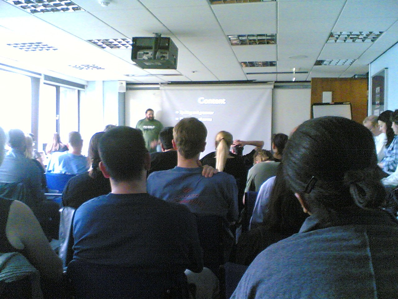
Content and Cognition - Ian Pouncey (slides)
Ian presented some practical advice based on his years of experience working in web accessibility:
- Consistency: Make your navigation consistent, don't chop and change main navigation between pages; use a small number of fonts, counting different sizes and weights as different fonts; make sure your interactive elements, links and buttons, are the same across all pages and clearly are links and buttons.
- Structure: Make sure your headings are clear and meaningful and represent their associated content; Break content up into lists, keeping each point short and concise; Make use of whitespace, particularly horizontal spacing; clearly differentiate content types, eg, quotes.
- Focus: Avoid contrasting blocks of colour, eg. don't make your navigation more visually appealing than your main content; Avoid unexpected sound and moving content; Avoid popup windows and (after some comments from the audience) light boxes.
- Readability: Make sure you have adequate text size and line height; Limit your line length to 70-80 characters but avoid justification because of the 'rivers of white' problem; Make sure you have good colour contrast; Keep your paragraphs short.
- Transformability: Bearing in mind that you can't please everyone, you should make sure your content is easily transformed - ie. allows for resizing; Supports user stylesheets; Works well with images and/or styles disabled;; Make sure your content is printable, as many people prefer to read from paper; Provide an API or feed for when all else fails. In this section also mentioned that he thinks elastic layouts (where the size is based on the font size) are a bad idea - they make text resizing behave like page zoom, in effect taking an option away from the user.
- Content: Pay attention to your spelling and grammar, if you can't get someone else to review your writing then leave it for a few days and look at it with a fresh eye, also getting a screen reader to read it to you may help; Define your terms, avoid jargon but not at the expense of clarity; Always summarise your content - point, example, explanation, summary.
- Don't assume that 'simple' tasks are simple, eg. 2+2 and Dyscalculia.
- Similarly, questions like "What colour is the sky?" can cause problems both for those with a literal turn of mind and for those who struggle with language.
- Remember it's your job to determine if it's spam or not, not your user's.
The day concluded with Bruce asking for people to get involved with the WHAT-WG HTML5 work and share their opinion on two particular issues:
- The table summary attribute is to be removed in HTML5, as in HTML4 it is little used and is only to be read out to screen readers. The alternative currently recommended by the working group is to summarise the table in the preceding content.
- Another issue of concern is with the new HTML5 form controls. Currently they are not styleable with CSS, which means they will present as the host operating system defaults, which is good for consistency. On the other hand, if they're not styleable it's far more likely designers won't use them and will instead come up with their own non-standard controls, thus losing the semantic benefits.
If you have any opinions, please contact Bruce.
All in all another great day, out of 5. Watch the website for news of future events in the series or follow #standardsnext on Twitter.
| Print article | This entry was posted by robertc on 26/09/09 at 11:55:14 pm . Follow any responses to this post through RSS 2.0. |
-
-
 Wade: OK. Nevermind my previous comment. I kept working at it and…
- Wade: Thank you for this post. I’m a PHP noob. I’ve t…
 Alen Saqe: Thank you for the information. I updated using Windows so i…
 Tim: I am having mixed results aswell. I changed some of the fau…
 robertc: Hi Bert. You would have to mess around with co-ordinate sys…
 Bert Casier: This is nice!
Is there a way to specify pixel values for…
Bert Casier: This is nice!
Is there a way to specify pixel values for…
Buy my book!
 Hello! HTML5 and CSS3 available now
Buy my other book!
 Early access to HTML5 in Action available now