
Adventures in Web 3.0: Part 3 - More CSS 3
I talked about CSS3 in the last post in this semi-regular series on the web standards of the future, but there are some new features supported in the latest Chrome release and Firefox alpha which make this worth a second post. This time I'm going to focus on background sizing, CSS gradients and RGBA colours.
To start with, scaling background images with the background-size rule. I started off with the example code from the MDC article on -moz-background-size and tried to make a background image that covers the entire page:
body {
    background-image: url('bg-image-1.jpg');
    background-size: 100% 100%;
    -moz-background-size: 100% 100%;           /* Gecko 1.9.2 (Firefox 3.6) */
    -o-background-size: 100% 100%;             /* Opera 9.5 */
    -webkit-background-size: 100% 100%;        /* Safari 3.0 */
    -khtml-background-size: 100% 100%;         /* Konqueror 3.5.4 */
    -moz-border-image: url('bg-image-1.jpg') 0;/* Gecko 1.9.1 (Firefox 3.5) */
}
This results in a page which looks like this:

As you can see above, there is a way to support scaled backgrounds in Firefox 3.5 by using -moz-border-image. A while back I'd read a comment which indicated that border image ought to be able to achieve this sort of thing but, when I tried to understand the spec, I couldn't figure it out. The example above shows it's a lot less complex than I thought back then, unfortunately it doesn't work that well for this particular use case as the border-image inherits from body to html. This is not as weird as it might seem, there's specific discussion in the CSS spec of the inheritance relationship between the two - read the third and fourth paragraphs of this section. Unfortunately, you end up with a repeated background, even if you explicitly set the background and border images to none. The workaround for this, if you want to support Firefox 3.5, is to make sure there's no margins, padding or border on body in which case the repeated background will be covered up. The alternative, which I will follow for most of the rest of my examples, is not to worry about supporting Firefox 3.5.
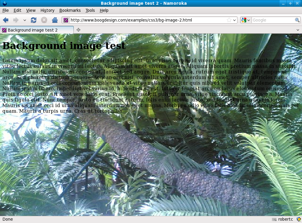
A second problem is that the background image only covers the area taken up by the body, if your browser window is longer than the body then the image repeats down the page. For certain images this may be what you want, in this case I wanted it to cover the whole background. This is easy to fix by adding background-attachment: fixed; to the CSS to arrive at my second example. This is what it looks like in Firefox with that change:
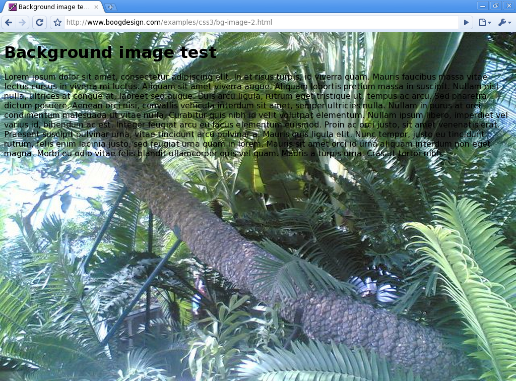
In Chromium, the scaled background image generally seems to be better quality - there is an image-rendering property but it didn't seem to make much difference.
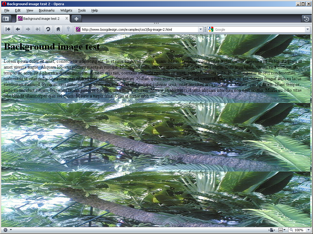
It also works in Opera 10, but only on Windows, and it doesn't scale to the full page height, and looks only marginally better than browsers with no background scaling:
The other problem with background-attachment: fixed; is, if your page is longer than a single screen, it noticeably impacts performance as you scroll up and down the page and the browser is forced to re-render everything.
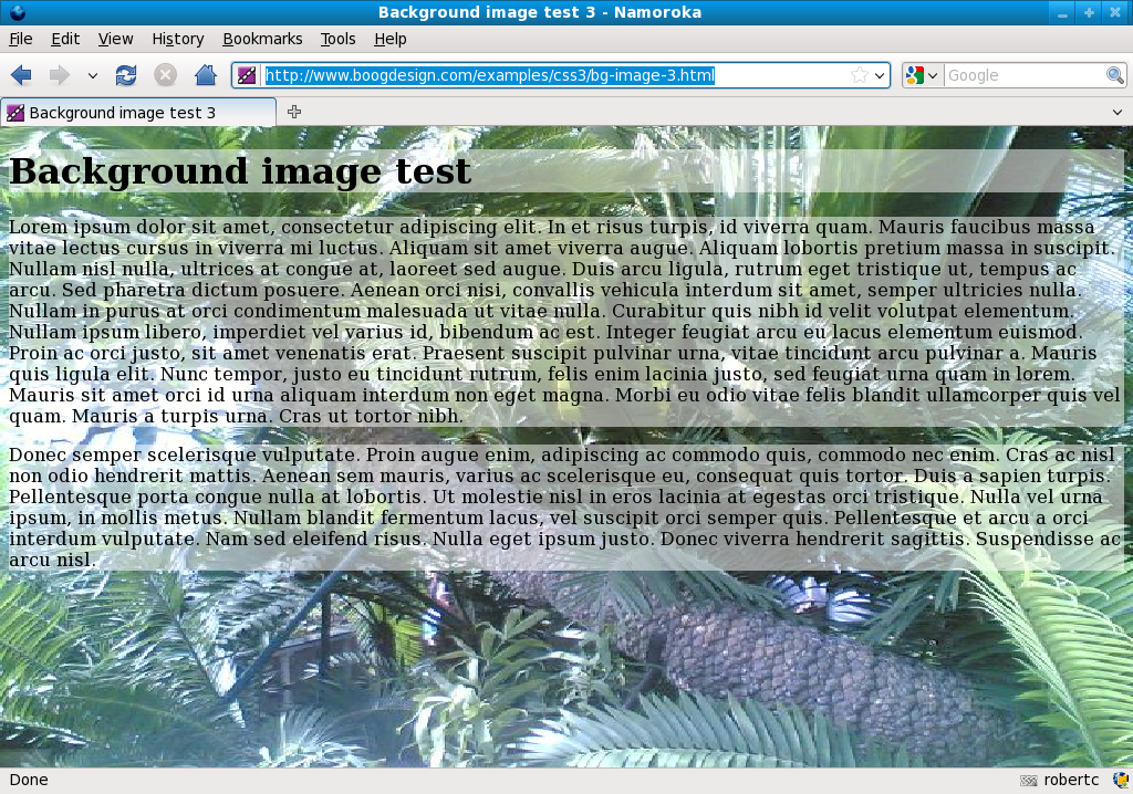
So, having successfully scaled a background image across the entire page my thoughts turned to the page content, now almost unreadable. Since this is the sort of arty design which is all about the background image we don't want to cover it up completely, but we do want to provide enough contrast to read by, so some sort of semi-transparent background is in order. There are all sorts of ways to do this already, and several of them can be made to work across browser (and so would be the ones to use in any 'real' website, of course). But rather than have an alpha transparent PNG as a background, or use CSS transparency on the back one of a pair of nested elements, let's use RGBA colours to set a semi-transparent background colour:
h1, p {
    background-color: rgba(255,255,255,0.5);
}
This specifies values for red, green and blue respectively as numbers between 0 and 255 and then a number between 0 and 1 for the transparency. So bright red would be rgba(255,0,0,1). This does make the text a bit more readable while leaving the background visible:
But perhaps, in the interests of exploration, we should relax this pesky 'readable' requirement and see what other effects can be achieved with CSS 3. One interesting possibility is the new gradient property introduced by WebKit and now also supported in the next version of Firefox. This allows you to produce some pretty crazy effects without any images at all:
The bottom paragraph is the one I started with and it's fairly straightforward, here's the code for it:
p {
    background-color: transparent;
    background-image: -moz-linear-gradient(top left, bottom left, from(rgba(255,255,255,0.9)), to(rgba(255,255,255,0)));
    background-image: -webkit-gradient(linear, left top, left bottom, from(rgba(255,255,255,0.9)), to(rgba(255,255,255,0)));
}
Unfortunately there are two different syntaxes. In Firefox/Gecko the gradient type is part of the rule name - -moz-linear-gradient - whereas in WebKit the type is the first parameter (the alternative to linear is radial). There's no W3C spec at the moment, so it's possible neither option will be the same as the standard. I also found that Chromium didn't work too well with top left though I don't think the order should make any difference. In both cases, what is specified is a linear gradient, from top left to bottom left starting at white with 90% opacity, ending at white with 0% opacity (ie. transparent). Note that, because I was inheriting a background-color of 50% opacity white on the p elements, I had to override that in this rule to make the bottom of the gradient fully transparent. This could cause some problems in practical scenarios, as you may want there to be a background colour where there is no gradient support and the gradient otherwise. An approach which works in Firefox is to use a background property instead of background-image, Firefox 3.5 then displays the default inherited RGBA background and ignores the whole rule with the gradient:
background: -moz-linear-gradient(top left, bottom left, from(rgba(255,255,255,0.9)), to(rgba(255,255,255,0))) transparent;
Of course, you could achieve the gradient effect with a tiled PNG background image, with background-size you could even make it stretch to fill behind arbitrary content, so why would you bother? There are two reasons:
- There is no need to download an additional file from the server, so pages should load (slightly) faster
- The gradient is recalculated when the browser is zoomed, so it will always be smooth, no image resizing artefacts
So, now we're into the spirit of things, let's try something a little more complex. The next gradient I added a colour as well as a transparency and also tried to make at an angle by going from top left to bottom right:
p {
    background-image: -moz-linear-gradient(top left, bottom right, from(green), to(rgba(0,255,0,0)));
    background-image: -webkit-gradient(linear, left top, right bottom, from(green), to(rgba(0,255,0,0)));
}
As far as I could tell, this made no difference - the gradient still went straight across the image:
Since the browsers seem to be ignoring it anyway, I removed the top and bottom. In Firefox this made no difference, however in Chromium it stopped the gradient showing at all. So although you have to specify both directions in Chromium, it always ignores at least one of them. If two match then they will be ignored, if they're all different then it's not clear which way round your gradient will be - try it and see.
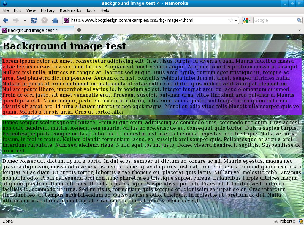
With CSS gradients you're not limited to heading smoothly from a single starting colour to a single ending colour, you can also visit any colour you want in between with a color-stop:
p {
    background-image: -moz-linear-gradient(left, right, from(rgba(255,0,0,0.8)), to(rgba(128,0,255,0.8)), color-stop(16%, rgba(255,165,0,0.7)), color-stop(32%, rgba(255,255,0,0.6)), color-stop(48%, rgba(0,128,0,0.5)), color-stop(60%, rgba(0,0,255,0.6)), color-stop(76%, rgba(75,0,130,0.7)));
    background-image: -webkit-gradient(linear, left top, right top, from(red), to(violet), color-stop(16%, rgba(255,165,0,0.7)), color-stop(32%, rgba(255,255,0,0.6)), color-stop(48%, rgba(0,128,0,0.5)), color-stop(60%, rgba(0,0,255,0.6)), color-stop(76%, rgba(75,0,130,0.7)));
}
This final example, which I adapted from the MDC page, paints a rainbow in the background. You can have an unlimited number of colour stops in your gradients, simply specify a percentage and a colour. If you specify 25% and blue then you gradient will pass through blue a quarter of the way along.
This post has been in gestation for over two months and I find myself well over my thousand word target for a post and only halfway through all the stuff I wanted to cover, so there will be at least one further post on CSS3. Having covered the basics of scaled backgrounds and gradients in this post, I'm aiming for some practical ways to use these features in web pages of the future.
| Print article | This entry was posted by robertc on 26/09/09 at 02:46:50 am . Follow any responses to this post through RSS 2.0. |
-
-
 Wade: OK. Nevermind my previous comment. I kept working at it and…
- Wade: Thank you for this post. I’m a PHP noob. I’ve t…
 Alen Saqe: Thank you for the information. I updated using Windows so i…
 Tim: I am having mixed results aswell. I changed some of the fau…
 robertc: Hi Bert. You would have to mess around with co-ordinate sys…
 Bert Casier: This is nice!
Is there a way to specify pixel values for…
Bert Casier: This is nice!
Is there a way to specify pixel values for…
Buy my book!
 Hello! HTML5 and CSS3 available now
Buy my other book!
 Early access to HTML5 in Action available now