
Real World CSS 3
I've done a number of posts recently on new features coming in CSS level 3. These posts have mostly been based on features available in the version fours of Safari and Chrome and the Firefox 3.6 release so, while they may be useful if you're producing an iPhone app, they don't seem like they'll be much use on general purpose websites where IE users need to be considered. In this post I'm going to look at how these new CSS features can be made to work, or at least degrade gracefully, in older browsers, including Internet Explorer. I'm going to extend the example from my earlier post on scaling background images and gradients to see what's possible.
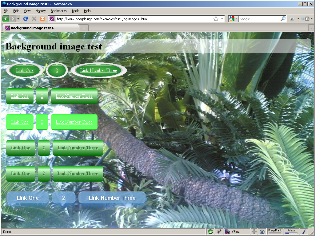
So my scaled background image looks OK in Firefox 3.6:
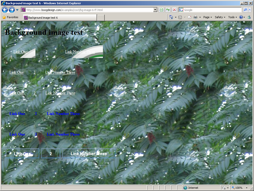
But it looks a bit crappy in Firefox 3.5, not to mention any other browser which doesn't support background-size:

There are going to be some cases where there's nothing you can do, for instance if you want some page elements to be in position over bits of the background, and will just need to take another approach (like putting the image in the page and using a negative z-index). However, in my case, I think that if users can't be treated to a nice full screen photo of palm trees then a tiling 'leafy' image would be an acceptable substitute without ruining the ambience. In order to provide one background image to browser which support sizing and another to those that don't I'm going to make use of another CSS3 feature, multiple background images. In CSS3 compatible browsers you can just provide multiple images in a comma separated list:
background-image: url('1-rhus-typhena-leaf-tile.jpg'), url('bg-image-1.jpg');
All the other background rules accept a similar comma separated list, including background-size. The nice thing about this is the stacking order of the images is defined in the spec:
The first image in the list is the layer closest to the user, the next one is painted behind the first, and so on. The background color, if present, is painted below all of the other layers.
So I put the tiling image 'closest to the user' then in my background-size set it to be zero size. Browsers which support background-size make that image disappear and show the scaled image behind it, those that don't show the tiling image:
background-size: 0% 0%, 100% 100%;
-moz-background-size: 0% 0%, 100% 100%;           /* Gecko 1.9.2 (Firefox 3.6) */
-o-background-size: 0% 0%, 100% 100%;             /* Opera 9.5 */
-webkit-background-size: 0% 0%, 100% 100%;        /* Safari 3.0 */
-khtml-background-size: 0% 0%, 100% 100%;         /* Konqueror 3.5.4 */
Note, the image doesn't actually disappear in WebKit, but if you set background-repeat: no-repeat it's very hard to spot. Opera 10.10 supports background-size (on Windows, anyway) but not multiple background images, which is unfortunate, but things work well on Opera 10.50. So now all we have to worry about is those browsers which don't support background-size or multiple background images. This is easy enough, as they should ignore all the rules they don't understand, so we just need to precede all of the above with a single background-image rule
background-image: url('1-rhus-typhena-leaf-tile.jpg');
Now each browser displays a background image according to their abilities, here's Firefox 3.5 after the fix:

With one further tweak, we can support IE too. The issue with IE is that it parses the multiple background images even though it doesn't understand them, treating them as a single, invalid background image. For this I resort to IE conditional comments:
<!--[if IE]>
<style type="text/css">
body {
    background-image: url('1-rhus-typhena-leaf-tile.jpg');
}
</style>
<![endif]-->
Something still needs to be done about the menu examples; to refresh your memory, the first menu example used a single 'button' background image:

This is amenable to the same multiple background hack. This time I used a one pixel wide slice of the button image and repeated it across the background:
background: url('bg-image-3.png') repeat-x;
background: url('bg-image-3.png') no-repeat, url('bg-image-2.png') no-repeat;   /* Image courtesy of http://blog.entropiads.com/2009/01/29/free-3-d-glossy-button-icons/ */
background-size: 0 0, 100% 100%;
-moz-background-size: 0 0, 100% 100%;           /* Gecko 1.9.2 (Firefox 3.6) */
-o-background-size: 0 0, 100% 100%;             /* Opera 9.5 */
-webkit-background-size: 0% 0%, 100% 100%;        /* Safari 3.0 */
-khtml-background-size: 0% 0%, 100% 100%;         /* Konqueror 3.5.4 */
Add some rounded corners and you end up with a reasonable approximation of the original buttons in Firefox 3.5:

The next set of buttons all used gradient backgrounds:

I'm just going to look at the first and the last one of these, as all the interesting bits will get covered in these two cases. One thing worth noting at this point - the syntax for specifying gradients has changed significantly in Firefox (and the standard) since the last time I discussed them. It's actually now a lot simpler. Old way:
background-image: -moz-linear-gradient(top, bottom, from(#090), to(#060), color-stop(25%, #cfc));
New way:
background-image: -moz-linear-gradient(top, #090, #cfc 25%, #060);
As you can see, the from, to and color-stop tokens have been removed and now, instead of stating the start and end colours and then any steps in between after that, the colours are now in the order they'll appear. The percentage value is now optional, if you don't specify it then the colour stops will be evenly distributed.
Because this example involves no transparency, supporting browsers which don't understand gradients is easy - just provide a background colour:
background-color: #080;
background-image: -moz-linear-gradient(top, #090, #cfc 25%, #060);
background-image: -webkit-gradient(linear, left top, left bottom, from(#090), to(#060), color-stop(25%, #cfc));
And (for a bit of variety), here's what it looks like in Opera 10.50 Alpha (on Linux):

You might settle for that in Internet Explorer, but you don't need to! IE has supported gradients since 5.5 thanks to the gradient filter. Here's a simple lighter to darker green gradient in IE8 CSS syntax:
-ms-filter: "progid:DXImageTransform.Microsoft.gradient(GradientType=0, startColorstr=#FF009900, endColorstr=#FF006600)";
And this is what it looks like in Internet Explorer 8:

While you sit there flabbergasted that, once again, IE seems to have been ahead all along in the race to snazzy CSS3 effects, there are a couple of caveats. First off, like all IE filters, underlying this is an ActiveX control, so expect strange issues related to stacking, clicking and (possibly) problems due to the security settings of extremely paranoid Windows admins. Secondly, you can't specify anything other than a flat gradient, there is no equivalent to colour stops. Finally, unlike the 'true' CSS gradients in Firefox and Safari, a filter in IE applies to the entire element instead of just a single property. So while in Firefox you can happily use a gradient in the background-image property and also specify a separate box-shadow property, in IE you have to use all the filters on a single -ms-filter property; this may not be a problem for you, but I've found that combining more than one filter of a different type on a single element can lead to some rather strange results, more on this below.
In my final example in my earlier post, I tried to do some no Image Aqua Buttons without adding additional markup to my fake menu. You may recall one of the issues I had was simulating the 'glare' with a radial gradient because there wasn't a way to make it anything other than round. In the new gradient syntax supported by Firefox, there is now a way to change the shape of the radial gradient:
background-image: -moz-radial-gradient(center 25%, ellipse farthest-side, rgba(255, 255, 255, 0.7), rgba(255, 255, 255, 0.1) 50%, rgba(255, 255, 255, 0));
You can now specify a shape, circle or ellipse, as well as a number of different 'size constants' - farthest-side in my example above. This allows a lot more flexibility for the radial gradients. Compare the orginal version:

With the new 'ellipse farthest-side' version:

Yes, I know, the difference is subtle ")
As I alluded to above, the main issue with these buttons is that we want them to be semi-transparent. Apart from IE, it's been a while since any other major browser didn't support RGBA colour - Opera 9.64 didn't support it, but Firefox 3.0 did. As long as a non-transparent colour is an acceptable fallback we can just rely on normal CSS precedence and specify two background colours:
background-color: rgb(60, 132, 198);
background-color: rgba(60, 132, 198, 0.8);
If you want a completely transparent background in the case where gradients are supported and a coloured background otherwise, you can specify everything in two background rules instead, browsers should ignore the rules they don't understand.:
background: rgb(60, 132, 198);
background: -moz-linear-gradient(left, rgba(28, 91, 155, 0.8), rgba(108, 191, 255, 0.9)) transparent;
Once again for IE we turn to the -ms-filter property. In the earlier gradient example you will have seen startColorstr=#FF009900 - the alpha value is that first hexadecimal pair (the rest make up a standard hex colour declaration), if you set it to something less than FF the colour will be partly transparent. Since I have two elements to use, the li and the a within it, I will attach a gradient filter to both:
div#nav2 ul li {
    -ms-filter: "progid:DXImageTransform.Microsoft.gradient(GradientType=1, startColorstr=#CC1C5B9B, endColorstr=#E56CBFFF)";
}
div#nav2 ul li a {
    -ms-filter: "progid:DXImageTransform.Microsoft.gradient(GradientType=0, startColorstr=#88FFFFFF, endColorstr=#00FFFFFF)";
}
The GradientType is 1 for horizontal and 0 for vertical, so the first declaration is a relatively solid dark blue to light blue horizontal gradient and the second declaration is a white to transparent vertical gradient. Finally in IE, because the -ms-filter property is stand-alone, the normal background colour has to be turned off in conditional comments:
<!--[if IE]>
<style type="text/css">
h1, div#nav1 ul li, div#nav2 ul li, div#nav2 ul li a {
    background-color: transparent;
}
</style>
<![endif]-->
This produces some acceptably 'glassy' buttons:

In Gecko and WebKit there is also text and box shadow, these can also be emulated by -ms-filter in IE8. It is possible to tack multiple filters on to the declaration like this:
div#nav2 ul li {
    -ms-filter: "progid:DXImageTransform.Microsoft.gradient(GradientType=1, startColorstr=#CC1C5B9B, endColorstr=#E56CBFFF) progid:DXImageTransform.Microsoft.Shadow(color=#3399EE,direction=180,strength=10)";
}
div#nav2 ul li a {
    -ms-filter: "progid:DXImageTransform.Microsoft.gradient(GradientType=0, startColorstr=#88FFFFFF, endColorstr=#00FFFFFF) progid:DXImageTransform.Microsoft.Shadow(color=#3399EE,direction=180,strength=10)";
}
The filters are applied in the order they appear in the rule. However, as I alluded to above, this doesn't always have the effect you might expect, here's the result of the above rules:

Not very useful! You may have better luck mixing other filters, or applying multiple filters of the same type, but in general I would recommend a one filter per element approach. In this case, I think the gradient is more important than the shadow for the general feel, so I'll stick with that.
So now the final 'compatible' version of my example page is ready. For some side by side comparisons, here it is at it's best in Firefox 3.6:

This is the same page in Internet Explorer 8:

And this is the same page again in the legacy Opera 9.64:

As you can see, the pages are by no means identical in every browser, but each is displaying the page according to its capabilities, with no need for Javascript hacks and only a little CSS trickery. So, if you are willing to accept that less capable browsers will show less stylish pages (and are willing to write a few redundant CSS rules), it is possible to use several CSS3 features on websites today.
| Print article | This entry was posted by robertc on 12/02/10 at 03:04:05 am . Follow any responses to this post through RSS 2.0. |
-
-
 Wade: OK. Nevermind my previous comment. I kept working at it and…
- Wade: Thank you for this post. I’m a PHP noob. I’ve t…
 Alen Saqe: Thank you for the information. I updated using Windows so i…
 Tim: I am having mixed results aswell. I changed some of the fau…
 robertc: Hi Bert. You would have to mess around with co-ordinate sys…
 Bert Casier: This is nice!
Is there a way to specify pixel values for…
Bert Casier: This is nice!
Is there a way to specify pixel values for…
Buy my book!
 Hello! HTML5 and CSS3 available now
Buy my other book!
 Early access to HTML5 in Action available now