
Adventures in Web 3.0: Part 4 - Yet More CSS 3
In my last post on CSS3 I looked at scaling background images, RGBA colours and CSS gradients. In the early hours of Saturday morning it became increasingly apparent to me that I'd bitten off a bit more than I could chew in terms of a single post, as there were a few other things I wanted to cover. These were some practical layouts you could achieve thanks to these new features and some more details of cross-browser and backwards compatibility, which I shall now attempt to cover in this post.
I decided to see what interesting effects could can be achieved in terms of navigation menus, assuming the fairly standard 'list of links' markup. I began with some fairly innocuous markup in the 'navigation as list of links' tradition:
<div id="nav">
    <ul>
        <li><a href="#">Link One</a></li>
        <li><a href="#">2</a></li>
        <li><a href="#">Link Number Three</a></li>
    </ul>
</div>
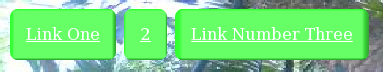
You can see that there are three links/buttons with varying lengths. Traditionally this causes problems with image backgrounds which lead to using sliding doors and related techniques. The task I set myself was to see what I could achieve visually with this using only CSS, no additional markup allowed. My first idea was simply to use a 'shiny button' background image and scale it using background-size:
div#nav ul li {
    padding: 1em;
    background-image: url('bg-image-2.png');   /* Image courtesy of http://blog.entropiads.com/2009/01/29/free-3-d-glossy-button-icons/ */
    background-size: 100% 100%;
    -moz-background-size: 100% 100%;           /* Gecko 1.9.2 (Firefox 3.6) */
    -o-background-size: 100% 100%;             /* Opera 9.5 */
    -webkit-background-size: 100% 100%;        /* Safari 3.0 */
    -khtml-background-size: 100% 100%;         /* Konqueror 3.5.4 */
}
div#nav ul li a {
    color: #fff;
    padding: 1em;
}
It seems to work quite well:

Note that this is doing something that you can't achieve with sliding doors - a typical sliding door image is uniform most of the way across, with something different in the first and last few pixels (eg. a rounded corner). So with a sliding doors approach as the button gets progressively wider the actual rounding becomes relatively smaller, whereas with a scaled background the rounding is relative to the size. This is something background scaling has in common with CSS gradients (ultimately they're just a different way to specify a scaled background) as we'll see below. This may or may not be an effect you want, I think if it's a more traditional sliding doors style look you're after then border-image is probably the thing to use.
For my next trick I decided to use CSS gradients to make some shiny buttons:
div#nav ul li {
    -moz-border-radius: 0.5em;
    -webkit-border-radius: 0.5em;
    background-image: -moz-linear-gradient(top, bottom, from(#090), to(#060), color-stop(25%, #cfc));
    background-image: -webkit-gradient(linear, left top, left bottom, from(#090), to(#060), color-stop(25%, #cfc));
}
div#nav ul li a {
    display: block;
    color: #fff;
    padding: 1em;
}
I discussed gradients towards the end of my last post on CSS3. The main gotcha is that Gecko and WebKit use a different syntax, though it's straightforward to translate between the two. I'm creating a top to bottom gradient from medium green to slightly darker green, but stopping at very light green one quarter of the way down. This is what it looks like:

Next I started thinking about whether it was possible to achieve a sliding doors style bevel effect with CSS gradients, by using a gradient with dark edges. My approach was to layer the gradients using alpha transparency to let the bottom one show through, a top to bottom one on the li with a left to right one on the a:
div#nav ul li {
    -moz-border-radius: 0.5em;
    -webkit-border-radius: 0.5em;
    overflow: hidden;
    background-image: -moz-linear-gradient(top, bottom, from(rgba(0,255,0,1)), to(rgba(0,51,0,1)), color-stop(2%, rgba(0,255,0,1)), color-stop(4%, rgba(102,255,102,1)), color-stop(96%, rgba(102,255,102,1)),color-stop(98%, rgba(0,153,0,1)));
    background-image: -webkit-gradient(linear, left top, left bottom, from(rgba(0,255,0,1)), to(rgba(0,51,0,1)), color-stop(2%, rgba(0,255,0,1)), color-stop(4%, rgba(102,255,102,1)), color-stop(96%, rgba(102,255,102,1)),color-stop(98%, rgba(0,153,0,1)));
}
div#nav ul li a {
    color: #fff;
    display: block;
    padding: 1em;
    -moz-border-radius: 0.5em;
    background-image: -moz-linear-gradient(left, right, from(rgba(0,255,0,0.5)), to(rgba(0,51,0,0.5)), color-stop(2%, rgba(0,255,0,0.5)), color-stop(4%, rgba(102,255,102,0.5)), color-stop(96%, rgba(102,255,102,0.5)),color-stop(98%, rgba(0,153,0,0.5)));
    background-image: -webkit-gradient(linear, left top, right top, from(rgba(0,255,0,0.5)), to(rgba(0,51,0,0.5)), color-stop(2%, rgba(0,255,0,0.5)), color-stop(4%, rgba(102,255,102,0.5)), color-stop(96%, rgba(102,255,102,0.5)),color-stop(98%, rgba(0,153,0,0.5)));
}
Here is the end result:
As you can see, it's not entirely effective thanks to the scaling issue I pointed out above. The width of the element is linked to the apparent depth of the bevel as you can only set the colour stops as percentages. For my test case of a collection of different width buttons this makes it look a bit funny, where it might work better is if you have a set of equal size buttons which scale according to font size - then the bevel wouldn't get less significant as the text got bigger.
Also note that, in CSS3, there's no need to use multiple elements in order to get multiple background images as a single element can have multiple backgrounds defined in its CSS rule. In this case it doesn't really matter, because the nature of a menu means I had two elements overlaid anyway, but I can get exactly the same effect as above by using the following CSS instead:
div#nav ul li {
    -moz-border-radius: 0.5em;
    -webkit-border-radius: 0.5em;
    overflow: hidden;
}
div#nav ul li a {
    color: #fff;
    display: block;
    padding: 1em;
    -moz-border-radius: 0.5em;
    background-image: -moz-linear-gradient(left, right, from(rgba(0,255,0,0.5)), to(rgba(0,51,0,0.5)), color-stop(2%, rgba(0,255,0,0.5)), color-stop(4%, rgba(102,255,102,0.5)), color-stop(96%, rgba(102,255,102,0.5)),color-stop(98%, rgba(0,153,0,0.5))),
                      -moz-linear-gradient(top, bottom, from(rgba(0,255,0,1)), to(rgba(0,51,0,1)), color-stop(2%, rgba(0,255,0,1)), color-stop(4%, rgba(102,255,102,1)), color-stop(96%, rgba(102,255,102,1)),color-stop(98%, rgba(0,153,0,1)));
    background-image: -webkit-gradient(linear, left top, right top, from(rgba(0,255,0,0.5)), to(rgba(0,51,0,0.5)), color-stop(2%, rgba(0,255,0,0.5)), color-stop(4%, rgba(102,255,102,0.5)), color-stop(96%, rgba(102,255,102,0.5)),color-stop(98%, rgba(0,153,0,0.5))),
                      -webkit-gradient(linear, left top, left bottom, from(rgba(0,255,0,1)), to(rgba(0,51,0,1)), color-stop(2%, rgba(0,255,0,1)), color-stop(4%, rgba(102,255,102,1)), color-stop(96%, rgba(102,255,102,1)),color-stop(98%, rgba(0,153,0,1)));
}
Simply list the images top to bottom in a comma separated list, so I simply took the gradient from the li rule above (the 'underneath' element) and added it after the a background.
At this point I gave up on the bevelled buttons and started thinking about some other 3D style effects that could be achieved. I went for some shiny, metallic style buttons with pseudo 3D indented text - the sort of thing you'd normally do in Photoshop:
div#nav ul li {
    -moz-border-radius: 0.5em;
    -webkit-border-radius: 0.5em;
    background-image: -moz-linear-gradient(top, bottom, from(#090), to(#060), color-stop(25%, #cfc));
    background-image: -webkit-gradient(linear, left top, left bottom, from(#090), to(#060), color-stop(25%, #cfc));
}
div#nav ul li a {
    color: rgba(0,51,0,0.5);
    text-decoration: none;
    font-weight: bold;
    display: block;
    padding: 1em;
    -moz-border-radius: 0.5em;
    text-shadow: 1px 1px rgba(204,255,204,0.5), -1px -1px rgba(51,102,51,0.5);
}
As you can see the gradient is the same as in the example above, but I've used multiple text shadows, one offset slightly above and left, the other below and right, to fake the 3D look:

This gives me an opportunity to do a declarative interactive effect with the hover rule. Reverse the text shadows and, because this will produce an apparent one pixel shift in the position of the text, translate the item to counter that:
div#nav ul li a:hover {
    text-shadow: -1px -1px rgba(204,255,204,0.5), 1px 1px rgba(51,102,51,0.5);
    -moz-transform:  translate(-1px, -1px);
    -webkit-transform:  translate(-1px, -1px);
}
Here's what one of the buttons looks like with the mouse pointer over:

It occurred to me that it would be possible to invert the apparent 3D of the whole button rather than just the text:
div#nav ul li:hover {
    -moz-border-radius: 0.5em;
    -webkit-border-radius: 0.5em;
    background-image: -moz-linear-gradient(bottom, top, from(#090), to(#060), color-stop(25%, #cfc));
    background-image: -webkit-gradient(linear, left bottom, left top, from(#090), to(#060), color-stop(25%, #cfc));
}
div#nav ul li a:hover {
    text-shadow: -1px -1px rgba(204,255,204,0.5), 1px 1px rgba(51,102,51,0.5);
    -moz-transform:  translate(-1px, -1px);
    -webkit-transform:  translate(-1px, -1px);
}
Of course, I'm not a graphic designer, so when I say reverse I really mean I just flipped it upside down, but I'm sure someone with some artistic skills could make it work properly. Here's what mine looks like:

So, on the subject of my lack of graphic design skills, I wondered if someone who had some skills had attempted this sort of thing. Google presented me with GirlieMac's CSS3 Gradients: No Image Aqua Button. Although this is pure CSS and uses no images, it does add additional markup. I started with her CSS but tried to apply it to my existing markup. Instead of adding an extra element for the glare I tried to achieve a similar effect with a radial gradient:
div#nav ul li {
    -webkit-border-radius: 16px;
    -moz-border-radius: 16px;
    border: 2px solid #ccc;
    position: relative;
    font-family: Lucida Sans, Helvetica, sans-serif;
    font-weight: 800;
    color: #fff;
    text-shadow: rgba(10, 10, 10, 0.5) 1px 2px 2px;
    text-align: center;
    vertical-align: middle;
    white-space: nowrap;
    text-overflow: ellipsis;
    overflow: hidden;
    background-color: rgba(60, 132, 198, 0.8);
    background-image: -moz-linear-gradient(0% 0%, 0% 100%, from(rgba(28, 91, 155, 0.8)), to(rgba(108, 191, 255, .9)));
    background-image: -webkit-gradient(linear, 0% 0%, 0% 90%, from(rgba(28, 91, 155, 0.8)), to(rgba(108, 191, 255, .9)));
    border-top-color: #8ba2c1;
    border-right-color: #5890bf;
    border-bottom-color: #4f93ca;
    border-left-color: #768fa5;
    -webkit-box-shadow: rgba(66, 140, 240, 0.5) 0px 10px 16px;
    -moz-box-shadow: rgba(66, 140, 240, 0.5) 0px 10px 16px; /* FF 3.5+ */
}
div#nav ul li a {
    display: block;
    color: #fff;
    text-decoration: none;
    padding: 10px 32px 6px;
    -webkit-border-radius: 8px;
    -moz-border-radius: 8px;
    background-color: rgba(255, 255, 255, 0.25);
    background-repeat: no-repeat;
    background-image: -moz-radial-gradient(center top, 5px, center top, 50px, from(rgba(255, 255, 255, 0.7)), to(rgba(255, 255, 255, 0)));
    background-image: -webkit-gradient(radial, 50% 0%, 5, 50% 0%, 50, from(rgba(255, 255, 255, 0.7)), to(rgba(255, 255, 255, 0)));
}
The radial gradient for the glare was the toughest thing as I couldn't find a way to make it anything other than round. There doesn't seem to be a way within the definition and applying background size to it didn't seem to work. In the end I settled for positioning it so the middle of the gradient was aligned with the top border:

That concludes my experiments with buttons, here's a page with all the button examples above, you need Firefox 3.6 or later or a recent Chrome/Safari to see everything working. As per usual there's more to say, but that will have to wait for (yet) another post ")
| Print article | This entry was posted by robertc on 21/10/09 at 02:50:26 pm . Follow any responses to this post through RSS 2.0. |
-
-
 Wade: OK. Nevermind my previous comment. I kept working at it and…
- Wade: Thank you for this post. I’m a PHP noob. I’ve t…
 Alen Saqe: Thank you for the information. I updated using Windows so i…
 Tim: I am having mixed results aswell. I changed some of the fau…
 robertc: Hi Bert. You would have to mess around with co-ordinate sys…
 Bert Casier: This is nice!
Is there a way to specify pixel values for…
Bert Casier: This is nice!
Is there a way to specify pixel values for…
Buy my book!
 Hello! HTML5 and CSS3 available now
Buy my other book!
 Early access to HTML5 in Action available now