
An Early Xmas Present - Opera 10.50 Pre-alpha
Opera gave web developers an early Xmas present this week when they released a 'pre-alpha' of Opera 10.5 for Windows and MacOS. The main new features are a new Javascript engine, Carakan, and a new vector graphics backend, Vega, for their Presto 2.5 rendering engine. With these in place Opera catches up with Gecko and WebKit in its support for, among other things, border-radius and CSS Transitions - which I covered in my first CSS3 post back in July. With that in mind I thought it would be worth updating my earlier examples with the Opera syntax to see how things looked.
Opera 10.50 uses the (soon to be) standard border-radius instead of a vendor specific property:
#mybox {
    border: 2px solid #666;
    overflow: hidden;
    -moz-border-radius: 20px;
    -webkit-border-radius: 20px;
    border-radius: 20px;
}
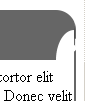
After changing all the examples, my first border test page looked like this:

The bad news is Opera has the same problem as Firefox in that it doesn't clip the contents of an element you've rounded the corners on, so you can end up with square corners sticking out through the rounded ones. It also treats the corners where only one side is 'thick and rounded' badly, similar bot not quite the same as Safari:
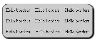
So our third implementation of border-radius manages to be subtly different from both existing implementations, though we can hope they all converge with time (this is pre-alpha, after all). I moved on to my borders and tables example page to have a look at how Opera handles box-shadow. Again, Opera implements the standard property, so it would have worked without any effort on my part if I'd just bothered to add the standard code in the first place ") Here's a simple drop shadow on a table:
Here's a simple drop shadow on a table:
#table {
    margin-top: 1em;
    background-color: #ccc;
    border: 2px solid #666;
    -moz-border-radius: 20px;
    -webkit-border-radius: 20px;
    border-radius: 20px;
    -moz-box-shadow: 3px 3px 5px black, 3px 3px 5px black;
    -webkit-box-shadow: 3px 3px 5px black, 3px 3px 5px black;
    box-shadow: 3px 3px 5px black, 3px 3px 5px black;
}
Opera looks much the same as Firefox and Safari/Chromium:
Putting the box-shadow on the table cells also worked well, even with border-radius applied:
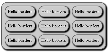
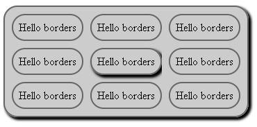
It also respects the infix value, like Firefox. Where it didn't look so good was if box-shadow was applied on :hover, it seems like it won't draw the drop shadow in any place outside of the original bounds of the element when the effect is applied dynamically:
Finally, CSS Transformations. Opera 10.50 has similar support to WebKit, though this time through vendor specific properties, allowing both for transformations and animations. This code, in Opera and Chromium/Safari, will spin the mybox div through ninety degrees over the course of a second when you mouse over it(in Firefox, it will flip straight away):
#mybox {
    border-top: 40px solid #666;
    border-bottom: 40px solid #666;
    -moz-border-radius: 20px;
    -webkit-border-radius: 20px;
    border-radius: 20px;
    -webkit-transition-duration: 1s;
    -o-transition-duration: 1s;
}
#mybox:hover {
    -moz-transform: rotate(-90deg);
    -webkit-transform: rotate(-90deg);
    -o-transform: rotate(-90deg);
    -webkit-transition-duration: 1s;
    -o-transition-duration: 1s;
}
Have a look at my transformation examples if you're interested.
Overall I think this is very promising for such an early release, although I didn't do much browsing on the internet I didn't see any crashes while testing my examples above. Hopefully the glitches will be worked on as 10.50 matures and we'll have yet another browser in which we can play fancy CSS3 tricks.
| Print article | This entry was posted by robertc on 25/12/09 at 12:45:02 am . Follow any responses to this post through RSS 2.0. |
-
-
 Wade: OK. Nevermind my previous comment. I kept working at it and…
- Wade: Thank you for this post. I’m a PHP noob. I’ve t…
 Alen Saqe: Thank you for the information. I updated using Windows so i…
 Tim: I am having mixed results aswell. I changed some of the fau…
 robertc: Hi Bert. You would have to mess around with co-ordinate sys…
 Bert Casier: This is nice!
Is there a way to specify pixel values for…
Bert Casier: This is nice!
Is there a way to specify pixel values for…
Buy my book!
 Hello! HTML5 and CSS3 available now
Buy my other book!
 Early access to HTML5 in Action available now