
Adventures in Web 3.0: Part 2 - CSS 3
Some time ago I wrote a post about my initial experiments with HTML 5. At the time I envisaged a series of posts as I explored new and future web technologies, so far it's been a series of length one ") But after Standards Next last weekend I've been inspired to do another post, this time I'm going to look at some of the neat things coming soon, to a browser near you, in CSS3.
But after Standards Next last weekend I've been inspired to do another post, this time I'm going to look at some of the neat things coming soon, to a browser near you, in CSS3.
Unlike it's predecessors, CSS3 is not a single, monolithic spec, but a collection of modules all of which are at different levels of completeness. For instance the selectors module became a candidate recommendation in November 2001 and is already widely supported. In this post I'm going to be experimenting with the Backgrounds and Borders module and the Transitions module, mostly because the recent Firefox 3.5 release includes improved (but still experimental) support for some of the more interesting bits of it.
I tested everything in Firefox 3.5 and Safari 4, and Chrome 3, though Chrome rendered identically to Safari as far as I could tell. The Gecko and WebKit engines have experimental support for CSS properties like border-radius implemented as vendor specific properties. Each browser engine has it's own prefix - for Gecko it's moz- and for WebKit it's webkit-, making the current Firefox implementation moz-border-radius and the Safari one webkit-border-radius. This does mean you have to specify everything twice, which is a bit of a pain, but it also avoids possible conflicts if the implementation changes as the spec gets finalized.
So I started with some simple markup (I've elided the lorem ipsum for brevity):
<div id="mybox">
    <h1>Big heading</h1>
    <p>Lorem ipsum ...semper eu urna.</p>
    <p>Aliquam at arcu ... luctus.</p>
</div>
My goal in this initial experiment was to get a box with nice rounded corners and the heading sitting in a bar along the top of it. This is my first attempt at the CSS:
#mybox1 {
    border: 2px solid #666;
    -moz-border-radius: 20px;
    -webkit-border-radius: 20px;
}
#mybox1 h1 {
    background-color: #666;
    margin-top: 0;
}
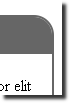
The main problem with this is that the background for the h1 sticks out over the top of the rounded corner:

The obvious approach for this is to put 'overflow: hidden' on the div, unfortunately this only seems to work in WebKit. So I wondered if perhaps I could put a rounded corner on the h1 so it would match:
#mybox h1 {
    background-color: #666;
    border: 2px solid #666;
    margin-top: 0;
    -moz-border-radius-topright: 20px;
    -webkit-border-top-right-radius: 20px
}
Although it stopped the overflow, the two borders didn't really line up and left some artifacts inside the border. I experimented with different radii, different border thicknesses, putting a border on the h1 too, and even putting a background colour on the whole div and then making the paragraph backgrounds white, but couldn't completely eliminate it:


The one thing that did work OK on Firefox was to make the top border really thick and then make the border itself the background for the h1, using a negative margin to push it into the border:
#mybox {
    border-top: 40px solid #666;
    border-bottom: 40px solid #666;
    border-left: 2px solid #666;
    border-right: 2px solid #666;
    -moz-border-radius: 20px;
    -webkit-border-radius: 20px;
}
#mybox h1 {
    background-color: #666;
    margin-top: -30px;
}
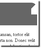
Having got it looking OK in Firefox, however, I notice that WebKit looks very strange:

When two borders coming into the rounded corner are different widths, Firefox rounds the corner of the 'thick' bit, whereas WebKit only rounds the corner on the thick line to the halfway point. The effect is especially pronounced when you make one of the borders zero thickness:
Here is my full set of border radius examples. Having spent enough time mucking around with the above fragment I decided to see how border-radius interacted with tables.
<table>
    <tr>
        <td>Hello borders</td>
        <td>Hello borders</td>
        <td>Hello borders</td>
    </tr>
    <tr>
        <td>Hello borders</td>
        <td>Hello borders</td>
        <td>Hello borders</td>
    </tr>
    <tr>
        <td>Hello borders</td>
        <td>Hello borders</td>
        <td>Hello borders</td>
    </tr>
</table>
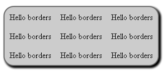
First I simply applied a border to the whole thing, as well as a drop shadow (just to keep things interesting). Here's the code:
#table {
    margin-top: 1em;
    background-color: #ccc;
    border: 2px solid #666;
    -moz-border-radius: 20px;
    -webkit-border-radius: 20px;
    -moz-box-shadow: 3px 3px 5px black, 3px 3px 5px black;
    -webkit-box-shadow: 3px 3px 5px black, 3px 3px 5px black;
}
#table td {
    padding: 0.5em;
}
And here is the result:
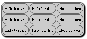
I did a quick test with a background colour on the table cells and noted that, similar to the
h1
and containing div elements, the td background sticks out past the rounded corner on the table. However, once you start applying the rounded corners to the td elements themselves, the effects get a bit more interesting:
Then I started adding a drop shadow to the cell elements too:

Here's the CSS for that last example:
table {
    margin-top: 1em;
    background-color: #ccc;
    border-collapse: separate;
    border-spacing: 10px;
    border: 2px solid #666;
    -moz-border-radius: 20px;
    -webkit-border-radius: 20px;
    -moz-box-shadow: 3px 3px 5px black, 3px 3px 5px black;
    -webkit-box-shadow: 3px 3px 5px black, 3px 3px 5px black;
}
table td {
    padding: 0.5em;
    border: 2px solid #666;
    -moz-border-radius: 20px;
    -webkit-border-radius: 20px;
    -moz-box-shadow: 3px 3px 5px black, 3px 3px 5px black;
    -webkit-box-shadow: 3px 3px 5px black, 3px 3px 5px black;
}
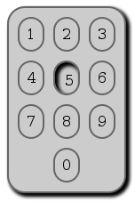
Now you've seen some examples, a brief aside about the box-shadow CSS property. Here's the spec, as before Gecko and Webkit have their current implementations available through vendor specific extensions. To specify a shadow you give a vertical offset, a horizontal offset, (optionally) a blur radius - these should be familiar terms if you've ever used Photoshop - and a colour. More than one drop shadow can be specified, there are two in the code above (because it looks nice that way ). You can also use the inset keyword to make the drop shadow appear inside the element instead of outside it (doesn't yet work in WebKit). In the spirit of just trying stuff out to see what happens, I tried putting an infix drop shadow on the :hover pseudo class of the td element. This creates a button pressing effect, though for realism I decided that the contents of the cells would also need to move as the drop shadow appeared, I also went ahead and turned my sample table into a keypad:
<table>
    <tr>
        <td><span>1</span></td>
        <td><span>2</span></td>
        <td><span>3</span></td>
    </tr>
    <tr>
        <td><span>4</span></td>
        <td><span>5</span></td>
        <td><span>6</span></td>
    </tr>
    <tr>
        <td><span>7</span></td>
        <td><span>8</span></td>
        <td><span>9</span></td>
    </tr>
    <tr>
        <td></td>
        <td><span>0</span></td>
        <td></td>
    </tr>
</table>
This is the CSS I ended up with:
table {
    margin-top: 1em;
    background-color: #ccc;
    border-collapse: separate;
    border-spacing: 10px;
    border: 2px solid #666;
    empty-cells:hide;
    -moz-border-radius: 20px;
    -webkit-border-radius: 20px;
    -moz-box-shadow: 3px 3px 5px black, 3px 3px 5px black;
    -webkit-box-shadow: 3px 3px 5px black, 3px 3px 5px black;
}
table td {
    padding: 0.5em;
    border: 2px solid #666;
    -moz-border-radius: 20px;
    -webkit-border-radius: 20px;
}
table td:hover {
    -moz-box-shadow: inset 3px 3px 5px black, inset 3px 3px 5px black;
    -webkit-box-shadow: 3px 3px 5px black, 3px 3px 5px black;
}
table td:hover span {
    -moz-transform-origin: top left;
    -webkit-transform-origin: top left;
    -moz-transform: translate(3px, 3px);
    -webkit-transform: translate(3px, 3px);
}
This worked quite well (I'm hovering over the number 5 in this screenshot):
You'll notice I've started adding transform rules in the above CSS, and that's what I want to talk about next, but first a few notes about the table examples. First off, I'm not advocating the use of tables to lay out phone keypad type interfaces, that's just where I ended up while exploring - it could equally well have been a more semantically appropriate element. Second, I noticed a weird effect in Safari when the table cells just contained one number - the rounded corners didn't get applied:

Though Chromium on Ubuntu rounded these corners OK, so I'm assuming this is an issue fixed in a later build of WebKit. Here is my full set of table and drop shadow examples.
So, finishing off with the fun stuff - CSS Transformations! The spec is quite a hard read, I found it much easier just to try out a few examples and see what happens. The basic rule is -moz-transform or -webkit-transform, and then you have a choice of operators which can be applied, individually and in combination. You've already seen translate above - which moves the element by the specified number of pixels in the x and y axes, the other fun one is rotate:
#mybox {
    border: 2px solid #666;
    -moz-border-radius: 20px;
    -webkit-border-radius: 20px;
    -moz-transform: rotate(45deg);
    -webkit-transform: rotate(45deg);
}
The above, when applied to the HTML I was using at the start of the article, rotates the box 45 degrees clockwise. As before you can use these rules in the :hover pseudo class to do the sort of effects that would previously have been accomplished with Javascript. WebKit is especially cool for this as it lets you specify a duration for the transition:
#mybox {
    border-top: 40px solid #666;
    border-bottom: 40px solid #666;
    -moz-border-radius: 20px;
    -webkit-border-radius: 20px;
    -webkit-transition-duration: 1s;
}
#mybox:hover {
    -moz-transform: rotate(-90deg);
    -webkit-transform: rotate(-90deg);
    -webkit-transition-duration: 1s;
}
The above CSS rotates the box 90 degrees anticlockwise when you mouseover, and takes one second to animate the transition from the 'normal' state to the rotated version. It's harder to describe than it is to see, so you may as well take a look at my transformation examples. One thing that's worth noting - Firefox seems to change the z-index of the element when you hover over it, whereas Safari doesn't. If you rotate an element in Firefox it will cover up everything it rotates over, in Safari everything will just mix together - I recommend testing how your elements interact when they move over each other. Also, if you're going to move larger elements around with these rules in response to user activities like mousing over an element then there's a good chance that your transition will mean the mouse pointer is no longer over the element, which could certainly be confusing as the element flip flops.
| Print article | This entry was posted by robertc on 05/07/09 at 11:50:31 pm . Follow any responses to this post through RSS 2.0. |
-
-
 Wade: OK. Nevermind my previous comment. I kept working at it and…
- Wade: Thank you for this post. I’m a PHP noob. I’ve t…
 Alen Saqe: Thank you for the information. I updated using Windows so i…
 Tim: I am having mixed results aswell. I changed some of the fau…
 robertc: Hi Bert. You would have to mess around with co-ordinate sys…
 Bert Casier: This is nice!
Is there a way to specify pixel values for…
Bert Casier: This is nice!
Is there a way to specify pixel values for…
Buy my book!
 Hello! HTML5 and CSS3 available now
Buy my other book!
 Early access to HTML5 in Action available now