
Tech for Good Meetup - September 2013
Sep 13th
On Monday I attended the first Tech for Good Meetup, a showcase for startups aiming to solve social and environmental problems. The format was a series of lightening talks, an introduction from the sponsors followed by short presentations from five startups. This post comtains my notes and links.

Bethnal Green Ventures - Lily
The organiser/sponsor, Bethnal Green Ventures is a tech accelerator (like Y Combinator) for ?social good' startups. The idea is they give seed capital to a number of startups, along with some office space and a whole load of support and mentoring. Follow them at
@bg_ventures.
Echo - Matt
Echo stands for "EConomy of HOurs", the site is a broker for trading an hour of your work (an 'echo') for an hour of work from other people. They hope to create "a nationwide currency of echos". All hours are created equal, which I'm sure simplifies things but doesn't seem to me to offer much incentive to offer hours of work which require a lot of training (eg. legal or medical advice). Follow them at @economyofhours.
Winnow Solutions - Marc
1/3 of food is wasted globally per annum, this is equivalent to 300 billion dollars. Kitchens are very inefficient and waste 20% of food used. Winnow have developed a food waste 'smart meter' which allows easy logging and classification of food waste, leading to metrics and better awareness. The device saved £12k pa at its first trial site.
Follow them at @WinnowSolutions.
OpenSensors.io - Yodit
An aggregator for the internet of things, OpenSensors allows you to collect data from any device and easily perform data mashups combining both open and private data.
Follow them at @OpenSensorsIO.
SpeakSet - Ewan
The problem SpeakSet has set out to solve is that 1 million older people haven't spoken to friends or family in a month. This is not just a problem of lonliness, it is also a problem for healthcare delivery where there has been no innovation since Florence Nightingale. Average life expectancy goes up by 5 hours every day so this problem is only going to get worse. SpeakSet packages up a Skype style video calling service into a remote controlled TV interface. The grandchildren can use their existing smartphones to receive calls. Call your Grandparents tonight!
Follow them at @speaksetUK.
Flip Yourself - Bruno
A visual LinkedIn for kids. Young people don't know how to write CVs or evidence their achievements, they're not good at selling themselves. Flip Yourself allows them to collect evidence easily, using tools familiar to them from social media.
Follow them at @flipurself.
Upgrading a Geeksphone Keon to Firefox OS 1.1
Aug 11th
Note: This is not a technical post, it's more in the way of a story. If you're looking for step by step ROM flashing instructions this is not the post you are looking for, please refer to the Geeksphone docs.
A few months ago I bought a Geeksphone Keon in order to play around with Firefox OS. My brother did an unboxing video and, not too surprisingly, the comments from his audience of (mostly) high end smartphone users weren't too positive. This didn't bother me overly, I knew what I was getting: a developer phone with a beta operating system, what excited me was the idea of an open phone platform for which the web technologies I am well familiar with were the primary app development paradigm.
The thing that did disappoint me about the phone was that GPS seemed to be non-functional. I tried a few things like leaving it by a window or visiting wide open spaces, waited for some OS upgrades and tried them again, but however long I left it the GPS never got a lock; instead it just flashed away in the notification bar and drained my battery. Since pretty much all the useful apps I could think of depended on GPS this failure quickly drained my enthusiasm both for the device and any potential app development adventures so I put the device aside for several weeks.
During this time Google has set about removing the most useful feature of Android and the top device manufacturers seem to be hell bent on only providing you with top end processing power in phones that are too big to be comfortably operated with one hand. Now that they've achieved market dominance Google seem to be locking down the bits that made Android interesting to me as an open alternative to iOS in the first place. So I've started to consider other options for my next 'proper' phone. In this frame of mind I came across Geeksphone's new device, the Peak+ - doesn't seem to be significantly less powerful than the HTC One Mini, lets you plug in a MicroSD card and about half the price. Plus I'd get the warm, glowy feeling from owning a 'properly' open device. But of course none of that would be any use to me is something as basic as GPS didn't work, which leads directly to today's adventures in ROM flashing.
Geeksphone provide an easy download page for all their ROMS, you can choose from stable (1.0), beta (1.1) and nightly (1.2):

Download your chosen image then the process is quite straightforward:
- Unzip and
cdinto the directory - Connect your Keon by USB and enable remote debugging (Settings > Device Information > More Information > Developer > Remote debugging)
- Issue the command:
sudo ./flash.sh - Answer the question about keeping user data
- Wait until the phone reboots; you're done
Simple. So, of course, the first time I tried it the phone wouldn't reboot. I saw the startup screen but not the Firefox OS splash screen. I found a blog post with a section “Ok, I bricked my phone” and followed the steps, unfortunately the same result. In desperation I tried downloading the image again and noticed I'd been trying to install the 9th August build when the 10th August build was available. Downloaded the new build, flashed and voilà I once again had a working phone.
The first happy news:


GPS works! The second thing I noticed, as I was taking the screenshots, was that it's now optional to have an SD card. Firefox OS 1.0 wouldn't even let me take pictures until I put a card in, now stuff is saved to the device by default:

The other major change from Firefox OS 1.0 is the home screen. Previously there was a basically empty home screen and, one swipe to the left, an 'apps search' screen with a bunch of icons on it (though not for apps, just links to websites). Now there is just the home screen with a search box, typing stuff into it brings up the icons like before along with a relevant background image:


Overall I'm very satisfied. Upgrading is easy, the upgrade actually fixes stuff as well as improving performance. I'm going to seriously consider getting a Peak+.
Update: Features for Font Fanatics
Jun 12th
Some time ago I wrote a blog post Firefox 4.0 Features for Font Fanatics. Since that time the spec has evolved and support has arrived in Chrome and IE10 so I thought it was worth an update.
Here's the example CSS rule from the original post:
.example {
    font-feature-settings: "dlig=1,tnum=1,ss01=1";
}
This is what the syntax now looks like:
.example {
    font-feature-settings: "dlig" 1, "tnum" 1, "ss01" 1;
}
As you can see the change is subtle. For practical support you'll need to use vendor prefixes, of course:
.example {
    -moz-font-feature-settings: "dlig" 1, "tnum" 1, "ss01" 1;
    -webkit-font-feature-settings: "dlig" 1, "tnum" 1, "ss01" 1;
    -ms-font-feature-settings: "dlig" 1, "tnum" 1, "ss01" 1;
}
I've updated my examples to use the new syntax:
OpenTech 2013
May 23rd
It's been a while since I've written a proper blog post but now that my 'professional' writing obligations are mostly out of the way I've been meaning to return to my amateur ramblings. As I attended OpenTech 2013 at the weekend I thought this was a great opportunity to get back into the swing of things. I've been to a few of these events now and they're always well organised and thought provoking, this year was no exception. Each of the six timetable slots through the day had three rooms with sessions and each of those sessions had 2 or (usually) 3 talks. So obviously I was only able to be in one of those rooms at once and see only about one third of the speakers, but I've assembled all those speakers into my OpenTech 2013 twitter list and in this post I'll give my potted impressions of each talk.
Session 1 (Stream C)
- Farmification - the joystick factory - Lisa Ma - When everyone is using touchscreen devices, what happens to all the people working in the mouse factories? Lisa has been creating programmes to encourage workers to do part time farming work so that they have something to fall back on when the hard times come. An interesting alternative to 20% time.
- House on Github - Francis Irving - Francis is recording issues with his house on GitHub, he thinks that in the same way that he put his CV online in 1996 and now everyone's doing it, by 2023 everyone will be doing this too. The serious point of the talk was that to effect change in the behaviour of the general population, to cross the chasm, requires geeks to hack the market, not just the tech.
- The Constitutional Excerpts Project - James Melton - a project to create semantically indexed and fully searchable database of the world's constitutions, because generally people that are writing constitutions are doing it for the first and only time in their lives and could do with some help.
Session 2 (Stream B)
- The Children's Republic of Shoreditch - Lucy Macnab - a fascinating project run from the back of a fascinating shop, I urge you to check out the video.
- Writers Centre Norwich - Chris Gribble - Chris wants 'creative people' and 'technical people' to get together and create fictional works featuring and about technology while still being 'literature'. However it was clear he'd never read any SciFi, which I think set him apart from most of his audience, and when directly asked why he didn't think 'technical people' couldn't also be 'creative people' his answer, even though he denied he thought that, described them as two separate communities who needed to be somehow united.
- School of Data - Tony Hirst - a project to educate civil society organizations, journalists and citizens in the skills needed to analyse publically available data and 'find the story' through a combination of outreach, training and crowd sourcing.
Session 3 (Stream B)

- Unix FPGA - Beyond just Finance - Graeme Burnett - using Field-programmable gate arrays in high speed trading platforms where 80GbE throughput will soon be a common requirement.
- Raspberry Pi - Rob Bishop - An interesting talk on problems and possibilities from one of the Pi developers. Although four fifths of the audience owned a Pi only one fifth had actually built something with one.
Session 4 (Stream A)

- Tiny Data - Richard Pope - A number of practical projects for easy data visualization, including the bicycle barometer.
- Bribing MPs with Crowdsourcing *Satire* (probably) - Terence Eden - definitely the most amusing talk of the day, but inspired some discussion on the serious issue of how the general public can overcome the concentrated buying power of rich people with special interests.
- The Domain Logic of Direct Action - Stephen Reid - Beautiful Trouble is a book and web toolbox that puts the accumulated wisdom of decades of creative protest into the hands of the next generation of change-makers.
Session 5 (Stream B)
- Big Data for Real People - Chris Osborne - The 4 rules of data visualization are that data should be:
- Personalized - relevant to the person viewing the data
- Accessible - don't set a science exam because, unlike you, most people dislike science (and graphs)
- Actionable - data is no use if you can't do anything as the result of seeing it
- Instinctive - recognizes human behaviour and the environment the decision is being made in
- Doing Good With (open) Data - Duncan Ross - As we enter the age of big data what will the legal and moral framework for using that data look like? The major pieces of legislation which govern big data are old (1995 for the EU Data Protection Directive, 1791 for the US Bill of Rights) and cannot hope to keep pace with the speed of change of the Internet. How will society ensure big business uses big data in a moral way when we're not event sure what that morality will be? DataKind UK brings together leading data scientists with high impact social organizations through a comprehensive, collaborative approach that leads to shared insights, greater understanding, and positive action through data in the service of humanity.
- What do Open Sensor Networks mean for citizen science? - Dan McQuillan - There is so much data available nowadays that statistical methods are often used in place of traditional knowledge gathering, for instance drone strike targets are governed by a data mining algorithm rather than on the ground intelligence. But this huge pool of data can be used for good if we can stimulate people with technical and data mining skills to consider social issues.
Session 6 (Stream A)
- The STEMettes - Stemettes - Providing events, support and strong role models for women in Science, Technology, Engineering and Maths. Role models are important: hack days delivered by women for women and girls produce better engagement than those delivered by men, similarly recruitment events delivered by a team including female members produce a far higher proportion of female applicants. Also women tend to be motivated by the outcomes rather than the opportunity to simply experiment.
- FOSSbox - Paula Graham - it is understood that diverse teams produce better solutions, but only 3% of FLOSS contributions are from women. Fossbox actively support women contributing to open source projects.
- Practical Diversity - Meri Williams - an excellent presentation with practical advice for fostering a more diverse work environment.
Drag and Drop and Delegate
Jun 3rd
HTML5 Drag and Drop has been popular topic recently on web tech blogs, a good example is Alexis Goldstein's post on Sitepoint which I converted to work in IE. Fortunately for me this all coincided with spending a lot of time working on Drag and Drop for chapter 6 of my book and a project coming up at work where it was a natural fit. So I've been doing a lot of dragging and dropping in recent weeks, to the point where I started to feel like I knew as much about the practical implementation of the Drag and Drop API as any person living.
Of course, whenever I start getting a bit full of myself something soon happens to make me feel like an idiot again. In this case it's my continuing blind spot when it comes to DOM Event Delegation. If you look again at Alexis' example you'll note that all the event handlers are bound directly to the elements where the events are expected to happen. This is a common pattern in example code - it's a straightforward relationship for beginners to understand - but it's not really the best way to do it, and this post is going to explain why. Let's review the code for the drop event:
$('#todo, #inprogress, #done').bind('drop', function(event) {
    var notecard = event.originalEvent.dataTransfer.getData("text/plain");
    event.target.appendChild(document.getElementById(notecard));
    event.preventDefault();
});
What this code does is bind a drop handler to three separate elements specified by the IDs in the selector - #todo, #inprogress, #done. Now have a look at this screenshot of the original planning board in action:

The task 'Learn HTML5' as been dropped directly inside the task 'Learn CSS3' and the 'Learn CSS3' task accepted the drop and ran the drop handler code despite not being mentioned above - why? The answer is because of event delegation. While in this particular case it may look like a bug, this is actually a very powerful and useful process. Here's what's happening when the 'Learn HTML5' task is dropped:
- The drop event is fired on the 'Learn CSS3' element
- Because there is no drop handler, the event is passed up the document tree< to the parent element - in this case
#inprogress - There is a drop handler on the
#inprogress, so that handler is run
This process is called event bubbling - the events rise up through the DOM tree like bubbles through water, and the consequence of the bubbling here is that the event is fired on the 'Learn CSS3' element, which remains the target of the event, but it's processed by the event handler on the #inprogress element. Because the handler just says 'append the dragged element as a child of the event target' the 'Learn HTML5' element is added as the last child of 'Learn CSS3'.
Initially you might see this as a bug, but really it's an opportunity. As long as we deal with this unwanted side effect we're freed from having to attach event handlers to every single element. If this doesn't seem like a huge gain, consider these two scenarios:
- You want to scale up to handle have a large number of draggable items and drop targets, into the thousands
- You want to add and remove draggable items and drop targets dynamically
The first scenario was the one I found myself in with my work project - the drop targets were cells in a table, with over fifty columns and possibly hundreds of rows, and 30-50% of those cells had draggable items in. When I started with the naive approach of binding a handler to each item it took a second or two to run the initialisation code in the good browsers (in IE8 it took nearly 30 seconds...). Event delegation helps in this scenario because the number of events you have to bind is equal to the number of events you want to capture, not the number of elements you want to capture them on.
It's unlikely an agile planning board is going to end up with that many elements though - if it does I suspect there's a good chance you're not really being agile, but the second scenario is more likely to come up. The tasks and the available resources will likely change from sprint to sprint, you may also want to add in some extra statuses. With the current code, every time you want to add an element you will have to attach all the relevant event handlers to it (even if jQuery makes that easy for you, that could still be a lot of overhead). If you forget to do that in a particular code path then strange bugs will likely ensue, which is a shame when all you really want is for the new elements to execute the exact same handlers as all the existing ones. Let's look at how easy this all becomes if you don't try to bind event handlers to every single element.
First, some adjustments to the markup. Because there'll now (potentially) be multiple rows on the board we can't use id attributes to distinguish them so they'll have to be a class. We'll also add a 'row title' for the developer name, and
<div id="board">
    <div id="rob">
        <h1 class="title">Rob</h1>
        <div class="todo droptarget">
            <h2 class="title">To Do</h1>
            <a id="item1" draggable="true" href="#">
                <div class="cardTitle">
                    Learn HTML5
                </div>
            </a>
            <a id="item2" draggable="true" href="#">
                <div class="cardTitle">
                    Learn CSS3
                </div>
            </a>
        </div>
        <div class="inprogress droptarget">
            <h2 class="title">In Progress</h1>
        </div>
        <div class="done droptarget">
            <h2 class="title">Done</h1>
        </div>
    </div>
</div>
I've also added a class droptarget to make life easier in the event handlers. Those event handlers will, of course, have to change. Here's a before and after of the dragstart handler:
Before
$('#item1, #item2').bind('dragstart',
  function(event) {
    event.originalEvent.dataTransfer.setData(
        "Text",
        event.target.getAttribute('id')
    );
});
After
$('#board').bind('dragstart',
  function(event) {
    event.originalEvent.dataTransfer.setData(
        "Text",
        $(event.target).closest('a[id]').attr('id')
    );
});
The first, and most important, change is that the event is now attached to the #board element instead of to each individual draggable item. The second change is instead of assuming the event target is the planning item the code now looks for the closest parent element which matches what the draggable element is expected to look like. The next event to consider is dragover, here things are slightly more complicated:
Before
$('#todo, #inprogress, #done').bind('dragover',
    function(event) {
        event.preventDefault();
});
After
$('#board').bind('dragover', function(event) {
    if ($(event.target)
          .closest('.droptarget')
          .hasClass('droptarget')) {
	      event.preventDefault();
    }
});
Now that the handler is being attached to #board every element will trigger the dragoverdroptarget class added earlier. Finally let's consider the drop event:
Before
$('#todo, #inprogress, #done')
  .bind('drop',
    function(event) {
        var notecard = event
                .originalEvent
                .dataTransfer.getData("Text");
        event.target.appendChild(
            document.getElementById(notecard)
        );
        event.preventDefault();
  });
After
$('#board').bind('drop', function(event) {
    var notecard = event
            .originalEvent
            .dataTransfer.getData("Text");
    var drop = $(event.target).closest('.droptarget');
    drop.append($('#' + notecard));
    event.preventDefault();
});
Although every element which is a descendant of #board could potentially trigger this event, in practice it's only ever going to be the ones that triggered the event.preventDefault() on the dragover event - anything with class .droptarget or it's descendants. Instead of just assuming the target is where the dropped element has to be attached the closest ancestor with the right class is used, so we never end up with dropped tasks getting appended inside other tasks.
I think you'll agree it isn't really much more difficult to write the event handlers in such a way that they take advantage of event bubbling and so only need to be attached to a single element. Now that these changes have been made it's possible to add further developers, statuses or tasks just by generating and appending the appropriate HTML - no need to loop through the new elements and attach all the correct event handlers.
This example page adds several buttons for dynamically updating the planning board, just to show how easy it is. The code is also available on github.
IE10 and the Future of CSS Layout
Apr 20th
Last week the first developer preview of IE10 was released. Among several experimental features included were the first Microsoft implementations of CSS3 Flexible Box Layout Module and CSS3 Grid Alignment. These are possibly the most exciting things to be added to CSS since drop shadows...
First up the flexible box layout module, or flexboxes. This has already been implemented in Firefox and WebKit, but that version of flexboxes isn't very intuitive, and the draft has since seen a lot of updates. Interestingly, IE10PR1 implements the same version of the spec as Firefox and WebKit but with one important addition: multi-line flexboxes. For me the multi-line properties are what make flexboxes worthwhile for layout, otherwise nearly everything you might currently want to achieve can be done just as easily (and with better backwards compatibility) with display: table-cell.
This is the sort of thing that multi-line flexboxes are useful for, it's a layout typical of shopping and photo gallery sites:

Here's what my markup looks like, nothing more complex than a list with sixty items in it:
<ul>
    <li>1</li>
    <li>2</li>
    <li>3</li>
    ...
    <li>59</li>
    <li>60</li>
</ul>
And here's the CSS, the key things to look out for are the display: -ms-box and the -ms-box-lines:
body {
    width: 90%;
    margin: 0 5%;
}
ul {
    display: -ms-box;
    -ms-box-lines: multiple;
    list-style: none;
    width: auto;
    padding: 10px;
    border: 4px dashed #000;
}
li {
    display: block;
    -ms-box-flex: 1;
    padding: 1em;
    margin: 0.5em;
    min-width: 3em;
    border: 4px dashed #000;
}
You may be thinking that's not a hard thing to pull off, so let me show you the same page, in an 800 pixel wide browser above, at 640 and 480 pixels:


The number of cells across adjusts to match the width available, but, because these are flexboxes, the width of the elements themselves also adjust so that they always exactly fit the available width. This is unique among our current alternatives:
- If you were using floats or inline blocks then you'd have to set each element to a fixed width, meaning the container would have to be a fixed width so that the elements could fill it exactly. You'd have to use media queries to assign different fixed widths to the container to change the items per row according to screen resolution.
- If you were using a layout table or display: table-cell then, although the elements would expand to fit exactly, the number of items per row would be fixed by the markup.
However, nothing is perfect. My multi-line flexbox example has a total of 60 elements, and I picked this number because it is an exact multiple of 2, 3, 4, 5 and 6 (it's the expansion of them if I've got my maths terms right![]() ) - meaning that the number of elements will fill the grid whether there's 2, 3, 4, 5 or 6 elements per row. If there's a less perfect number, say 24, then the grid will look a little strange on the last row:
) - meaning that the number of elements will fill the grid whether there's 2, 3, 4, 5 or 6 elements per row. If there's a less perfect number, say 24, then the grid will look a little strange on the last row:

I think the box-align property should help with this, but I couldn't make it work in IE10PR1.
So, multi-line flexboxes could be a useful addition to the CSS toolbox when everyone gets round to upgrading to IE10, but, cool as they are, that's not the coolest experimental CSS layout implementation in IE10PR1. There have been a few grid and template based CSS proposals over the years but, apart from an incomplete JavaScript library for CSS Template Layout, none of them have ever been implemented in a major desktop browser. That is until last week, when IE10PR1 implemented Microsoft's own CSS Grid Align proposal from October 2010.
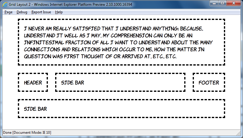
I want you to reflect, now, on all the fun you've had over the last ten years constructing CSS layouts of three equal height columns, with a header and footer, and making them work in IE6. Layouts something like this:

Are you remembering all the fun you had? Good, now look at this markup and contemplate how you'd turn it into a three column layout:
<header>Header</header>
<aside class="b">Side bar</aside>
<article>I never am really satisfied...</article>
<aside class="d">Side bar</aside>
<footer>Footer</footer>
Now look at this CSS and start wishing the future would arrive soon:
body {
    width: 90%;
    margin: 0 5%;
    display: -ms-grid;
    -ms-grid-columns: auto minmax(min-content, 1fr) auto;
    -ms-grid-rows: auto minmax(min-content, 1fr) auto;
}
article, aside, header, footer {
    margin: 1em;
    padding: 1em;
    outline: 4px dashed black;
}
header { -ms-grid-column: 1; -ms-grid-row: 1; -ms-grid-column-span: 3; }
aside.b { -ms-grid-column: 1; -ms-grid-row: 2; }
article { -ms-grid-column: 2; -ms-grid-row: 2; }
aside.d { -ms-grid-column: 3; -ms-grid-row: 2; }
footer { -ms-grid-column: 1; -ms-grid-row: 3; -ms-grid-column-span: 3; }
That's it, seven declarations is all you need for that three column layout with CSS Grid Align. For this first example I'm going to step through the key points line by line:
display: -ms-grid;
This is the bit which declares we will use the grid layout manager on the children of this element, in the same way that the flexbox layout manager was declared above with display: -ms-box.
-ms-grid-columns: auto minmax(min-content, 1fr) auto;
This line defines three columns, the first and last will shrink to fit the content - that's the default behaviour, similar to a table. The middle column will be a minimum of min-content, which is basically the same as auto, and a maximum of 1fr which is a 'fraction of available space' - quite similar to a flex unit and, since there's only one fractional column, basically equivalent to all the available space.
-ms-grid-rows: auto minmax(min-content, 1fr) auto;
We'll have three rows to go along with our three columns, I won't go over the individual values again. Now the fun stuff:
header { -ms-grid-column: 1; -ms-grid-row: 1; -ms-grid-column-span: 3; }
Put the header in the first column of the first row, and make it span three columns. That's it. Really, it's that simple. Let's just do one more:
article { -ms-grid-column: 2; -ms-grid-row: 2; }
Put the article in the second column and the second row. And make me some coffee, white, no sugar. Actually there isn't a CSS property for that yet, maybe CSS4...
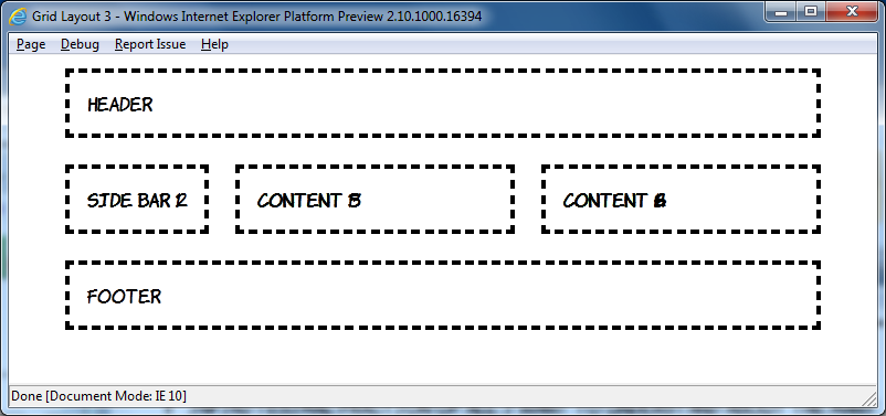
But it gets more cool than that. In the example above the order of the elements in the markup matched up with the order they were placed into the grid, but it doesn't have to be that way:
This amazing transformation was achieved without any changes in markup, just messing around with CSS:
header { -ms-grid-column: 1; -ms-grid-row: 2; }
aside.b { -ms-grid-column: 2; -ms-grid-row: 2; }
article { -ms-grid-column: 1; -ms-grid-row: 1; -ms-grid-column-span: 3; }
aside.d { -ms-grid-column: 1; -ms-grid-row: 3; -ms-grid-column-span: 3; }
footer { -ms-grid-column: 3; -ms-grid-row: 2; }
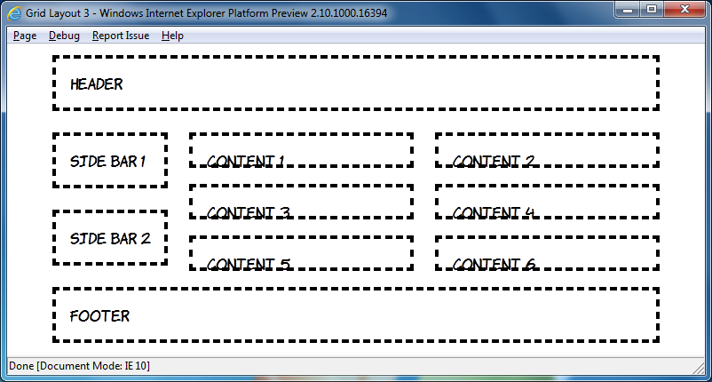
In the current draft there's a grid-cell-stacking property which will let you flow multiple elements into a single cell, but in the IE10PR1 implementation things just stack on top of each other:
This is a shame, because the markup is quite straightforward, I won't post all of it because this is already getting quite long (have a look), but here's the nice bit:
article:nth-child(2n+1) { -ms-grid-column: 1; }
article:nth-child(2n) { -ms-grid-column: 2; }
The article elements are assigned to grid cells alternately, unfortunately it doesn't work yet. However you can nest elements set to display: -ms-grid inside each other:
Have a look at the source code for that one, it gets pretty hairy, so rather than try and do that sort of thing it's probably best to use some wrapper elements like this:

Again, view the source code yourself to see how it's put together, but I think these things will be worth re-visiting in a later preview release.
I'm going to finish off with some adaptive layout. Grid Align is a great fit for this because of the complete independence of layout from source order. Here's what I put together based off the previous example at 800 pixel width:

Now here's the same page at 640 and 480 pixel widths:
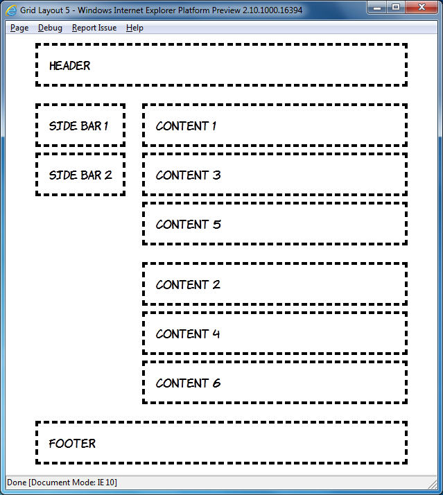
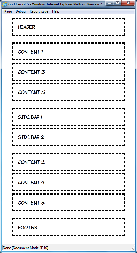
The markup is, of course, the same in each case:
<header>Header</header>
<div id="sidebar">
    <aside>Side bar 1</aside>
    <aside>Side bar 2</aside>
</div>
<div id="content1">
    <article>Content 1</article>
    <article>Content 3</article>
    <article>Content 5</article>
</div>
<div id="content2">
    <article>Content 2</article>
    <article>Content 4</article>
    <article>Content 6</article>
</div>
<footer>Footer</footer>
By default I've assumed a single column layout:
body {
    width: 90%;
    height: 90%;
    margin: 0 5%;
    display: -ms-grid;
    -ms-grid-rows: auto;
    -ms-grid-columns: 1fr;
}
article, aside, header, footer {
     margin: 1em;
     padding: 1em;
     outline: 4px dashed black;
}
header { -ms-grid-row: 1; }
#sidebar { -ms-grid-row: 3; }
#content1 { -ms-grid-row: 2; }
#content2 { -ms-grid-row: 4; }
footer {  -ms-grid-row: 5; }
Moving on to windows of a minimum width of 600 pixels, move up to two columns:
@media screen and (min-width: 600px) {
    body {
        -ms-grid-columns: auto 1fr;
        -ms-grid-rows: auto 1fr 1fr auto;
    }
    header { -ms-grid-column: 1; -ms-grid-row: 1; -ms-grid-column-span: 2; }
    #sidebar { -ms-grid-column: 1; -ms-grid-row: 2; -ms-grid-rowspan: 2; }
    #content1 { -ms-grid-column: 2; -ms-grid-row: 2; }
    #content2 { -ms-grid-column: 2; -ms-grid-row: 3; }
    footer { -ms-grid-column: 1; -ms-grid-row: 4; -ms-grid-column-span: 2; }
}
This is nothing you haven't seen already, but I'll just point out again how cool it is that you can place the elements wherever you want them. Finally, for windows of greater than 760 pixels width, switch back to the three column layout:
@media screen and (min-width: 760px) {
    body {
        -ms-grid-columns: auto 1fr 1fr;
        -ms-grid-rows: auto 1fr auto;
    }
    header { -ms-grid-column: 1; -ms-grid-row: 1; -ms-grid-column-span: 3; }
    #sidebar { -ms-grid-column: 1; -ms-grid-row: 2; }
    #content1 { -ms-grid-column: 2; -ms-grid-row: 2; }
    #content2 { -ms-grid-column: 3; -ms-grid-row: 2; }
    footer { -ms-grid-column: 1; -ms-grid-row: 3; -ms-grid-column-span: 3; }
}
If you've downloaded the IE10 developer preview have a play round with it yourself, and try not to think about how long you'll have to wait until all this stuff is available in production browsers ![]()
Client Side Server Side Includes
Jan 31st
I spent some time over Xmas reflecting on my past web adventures. My first ever website, a guide to local drinking establishments, was hosted on a cast-off server at Edinburgh University in late 1993, and the particular server and site are now long gone (although the server has been replaced). Similarly, my original mid-nineties home page, replete with animated GIFs and ripped off Homer Simpson images has also be consigned to the recycle bin of web history (thankfully). However, the first website I worked on 'professionally' is still online: iwant2bhealthy.com is a thousand page static HTML monolith which we maintained with Dreamweaver 3.
The site did take advantage of some server processing, it used Server Side Includes (SSI) to embed particular common items such as the main navigation and footer. SSI isn't so common these days when nearly every cheap host offers some sort of server side scripting language, so often it isn't turned on my default. The result is that the iwant2bhealthy.com website is missing its main navigation and footer on most pages, all that's left is some markup like this:
<!--#include virtual="/Library/mainmenu.shtml" -->
Or this:
<!--#include virtual="/Library/footer.shtml" -->
I had a hankering to experience the website in all its turn of the century glory and it seemed to me that I ought to be able write a bookmarklet to grab jQuery, grab the comments, fetch the includes with AJAX and insert them in place of the comments.
It turns out that the first tricky thing is grabbing the comment elements. The jQuery selection engine purposely ignores comments so none of those handy little methods are much use. There's not much option but to loop through the document and select based on nodeType (8 for a comment element), fortunately someone on the web had already done most of the hard work so I was able to adapt his code:
parseSSI : function(el) {
    var nodes = el.childNodes;
    var l = nodes.length;
    while (l--) {
        current = nodes[l];
        if (current.nodeType == 8) {
            //do stuff here
        } else if (current.nodeType != 3 && current.childElementCount > 0) {
            this.parseSSI(current);
        }
    }
}
The function loops through all the child nodes of a supplied element and, if they're a comment, does some processing. If the node isn't a comment we check that it's also not a text node and then call the function recursively if there are any child nodes.
Of course it's entirely possible that there are comments in the web page that have nothing to do with server side includes, so some sort of check is probably in order. Following James' example I used a regular expression:
re : /#include virtual=\"(.*)\"/i
My next step was to convert those comment elements into something that could be more easily manipulated by jQuery, so I decided to convert them to links:
var match = this.re.exec(current.data);
if (match != null) {
    var a = document.createElement('a');
    a.href = match[1];
    current.parentNode.replaceChild(a, current);
Now we're back in the nice, succinct land of jQuery - fetch the URL with Ajax and replace the relevant link element in the callback:
$.ajax({ url: match[1],
         success: function(data, textStatus, XMLHttpRequest){
            $('[href=' + this.url + ']').replaceWith(data);
        }});
Try out the final code here.
 Hello! HTML5 and CSS3 available now
 Early access to HTML5 in Action available now