
Firefox 4.0 Features for Font Fanatics
Check out the updated syntax in this newer post.
If you're following the development of CSS3 you may have seen, last June, a proposal from John Daggett of Mozilla to bring advanced typography control to the web. A few months later we saw some experimental Firefox builds which demonstrated the features. The terminology has been through a slight update since then, from font-feature-opentype to font-feature-settings, but last week these experiments finally made their way into the trunk builds of Firefox 4.0 on Windows and Mac.
Even though it doesn't yet work under Linux, I thought it was time to start investigating. In this post I'm going to have a look at what these features can look like, mostly following the examples from the October Mozilla Hacks blog post put using the Calluna Regular font. Then I'll show how to turn them on and off in Firefox with CSS, and find the various features using a font editor.
Open Type Font Features
A font is a collection of glyphs, graphical representations of letters, which are associated with characters. Font features are a scheme for getting alternative glyphs for a given character or sequence of characters. The full list of open type features is available in the spec. Each feature is associated with a four character identifier and can be set to on (1) or off (0), here's an example CSS rule:
.example {
    font-feature-settings: "dlig=1,tnum=1,ss01=1";
}
In the current Firefox 4.0 nightly builds you can enable support for the features below by setting the gfx.font_rendering.harfbuzz.level preference to 1 in about:config.
Ligatures
 Ligatures are special glyphs which replace runs of commonly occurring characters. There are two levels of ligatures, the standard ligatures are turned on by default in Firefox 4.0. To the left is an example in Calluna. The image on the left is from Firefox 3.6, on the right is Firefox 4.0, you can see the slight different where the two characters connect at the top. the combined glyph is also slightly narrower but that's quite hard to stop.
 The second example is slightly more obviously different, though with Calluna being a refined font they're still quite subtle. Again it's Firefox 3.6 on the right and 4.0 on the left, the first 'f' is noticeably smaller than the standard one and there's a single bar across both 'f' characters.
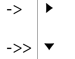 There are some ligatures which don't map to commonly occurring sequences of characters (I know fb might not strike you as particularly common, but there are at least 26 just in English). Calluna has two whole sets of arrow glyphs which replace sequences like '-->>' and '-->', more examples to the right.
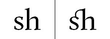
So in Firefox 4.0, if the font being used supports standard ligatures, you'll see them. If you want to give directions to Firefox users which will appear like random sequences of dashes and greater thans to everyone else you now can. But that's not all! There's also a more decorative set of combinations called discretionary ligatures. Here's some examples, normal on the left, discretionary ligatures on the right:

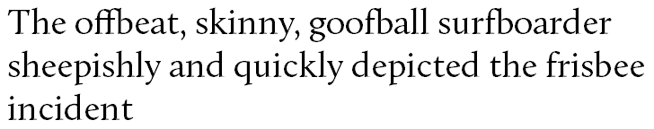
The point of all this is, of course, that it can all be controlled through CSS. I've constructed an example sentence which could easily occur in conversation at any time and just so happens to contain plenty of words which show off our ligatures. First, let's see what it looks like with everything disabled:

Here's the code to disable the standard ligatures in Firefox 4.0 using -moz-font-feature-settings:
.alloff {
    -moz-font-feature-settings: "liga=0";
}
The ligature feature is called liga. As I mentioned above, we can set it to 1 to enable (which is the default in Firefox 4.0) and 0 to disable. For comparison let's have a look at the standard Firefox 4.0 rendering:
The CSS for this is straightforward as, of course, there isn't any:
.normal {
    /* it's normal, no setting required...*/
}
Now let's turn on the discretionary ligatures:

The discretionary ligature feature is called dlig, again it's 1 to enable and 0 to disable:
.allon {
    -moz-font-feature-settings: "dlig=1";
}
It could be that, for some reason, you want the discretionary ligatures but not the standard ones:

Probably not much point with Calluna, but perhaps with a more decorative typeface this would be useful. You can pass several features to -moz-font-feature-settings in a comma separated list:
.discretionary {
    -moz-font-feature-settings: "liga=0,dlig=1";
}
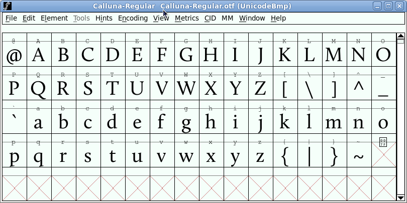
How do you go about finding all these ligatures, standard or discretionary? I used FontForge because it was easily installable on my laptop using yum, the interface is a bit archaic but it seems perfectly functional. Here's what it looks like after I've opened up the Calluna font:
On the view menu there's a combinations sub-menu upon which the ligatures option lives:

Now you have a list of ligatures to choose from:

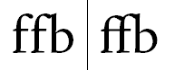
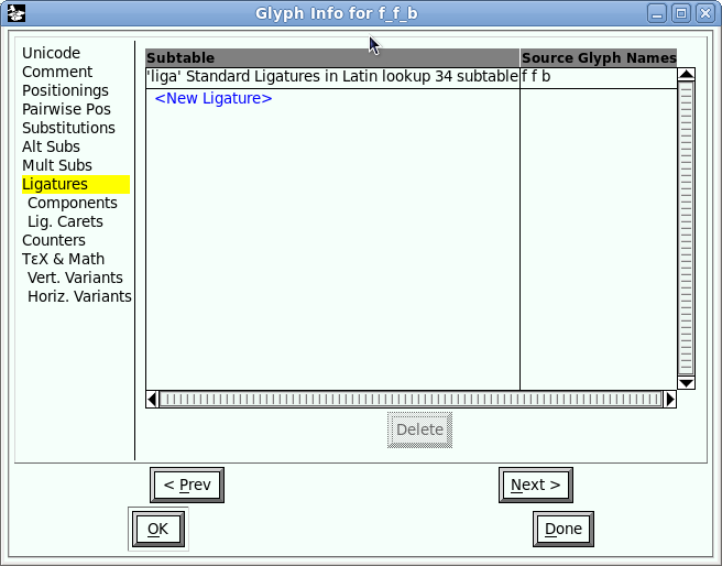
I opened up the 'ffb' ligature:

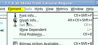
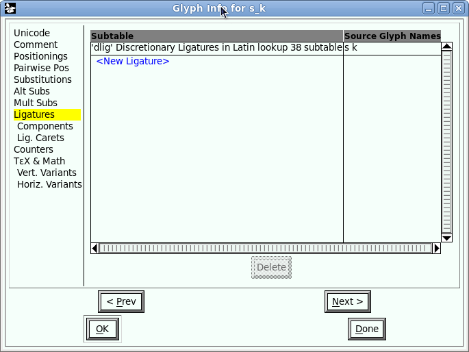
Now go to the view menu again and look up the Glyph Info option:
In the resulting dialogue you can see that 'ffb' is part of the set of standard ligatures:
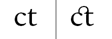
If instead I open up the 'sk' glyph you can see this is part of the discretionary ligature set:
Numerals
Now that we've had some fun with ligatures you may be wondering what other cool tricks are hidden inside open type fonts. One very practical feature is different styles of numbers. Quick pop quiz time, which is the highest number in the screenshot below?

Did you guess it was the second one, or did you have to count carefully? Numbers by default are proportionally spaced, which looks nice when they appear in text but can be misleading when looking at tables of figures. But now, thanks to -moz-font-feature-settings, we have some other options:

The numbers are now using tabular alignment - each number glyph is an equal width. Tabular numerals use the tnum feature:
.tabular {
    -moz-font-feature-settings: "tnum=1";
}
There are a few other number features. The default numbers in Calluna are 'old style' (onum), you can see there's quite a lot of variance caused by the descenders and ascenders going above and below the line. The alternative to that is 'lining figures' (lnum):

As you can see, they give a much more consistent line shape. And you can also have tabular, lining numerals:

.tabular-lining {
    -moz-font-feature-settings: "lnum=1,tnum=1";
}
Once again you can find all these alternatives in FontForge in the Glyph Info window:
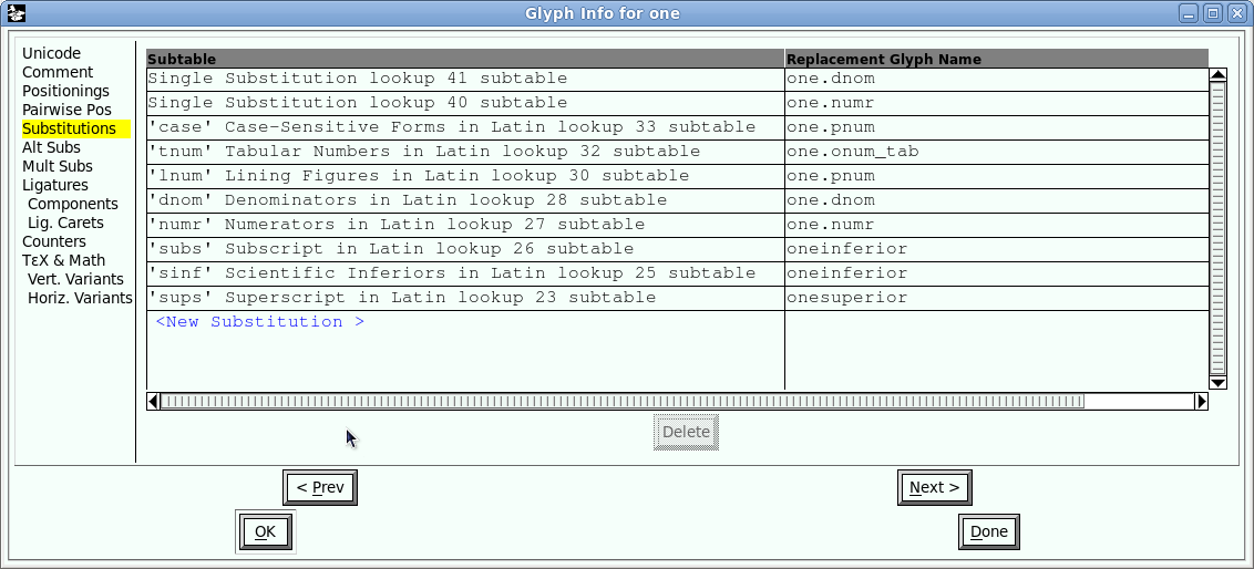
Before we finish up with numbers, two more features are worth mentioning. You can control whether or not the zero is 'slashed' with the zero feature:

The bottom number has -moz-font-feature-settings: "zero=1"; applied. You can also enable fractions with the frac feature setting:

Stylistic Alternatives
There's plenty more stuff in the open type spec, there are 134 different features listed in the spec I linked to in the introduction. The really fancy bits of fonts are often in the twenty 'stylistic sets' ss01 to ss20. You can find what options you may have in FontForge for a particular font by looking for the display substitutions option on the view menu:

You then get a dialogue with a list of the options:
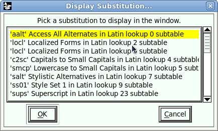
From which you can see that Calluna only has glyphs for one of the stylistic sets, and when you select ss01 you'll see that there's not a lot of (regular) characters in that:

And there's more...
There's plenty of other interesting stuff wrapped up in open type font feature settings, we haven't yet discussed swashes, contextual alternates or historical forms for just three examples, but I'll leave exploring those as an exercise for the reader.
Practical Considerations
It may seem slightly superfluous for me to mention this about a CSS feature which, so far, has only an experimental implementation in just one browser, but it would be unwise to build a site which depended on font-feature-opentype, for example by relying on certain ligatures or stylistic sets to convey information. However, for making your typography look a bit nicer for a subset of your users, this stuff will be usable on real web pages from the day of Firefox 4.0's release.
The Future
Now you're salivating for a future where all web browsers support font-feature-settings this is probably a good time to point out that, once that support exists, you'll hardly ever use it ![]() No, this is not a trick,
No, this is not a trick, font-feature-settings itself is only intended to be used for obscure and little used options in the open font features list, the common stuff will be accessible through new values on the font-variant property as well as several font-variant-* properties. The current level of support in Firefox is really only to see how things will look once all that gets implemented.
Let's have a look at how a future you will be recreating my examples with the proposed font-variant property extensions. First, discretionary ligatures:
.discretionary {
    font-variant: additional-ligatures;
}
Alternatively we cold use the specific ligatures property:
.discretionary {
    font-variant-ligatures: additional-ligatures;
}
Each value has a corresponding no-* version, so you could specify no-common-ligatures to turn off the common ones, or no-additional-ligatures in order to override the above rule further down the inheritance chain. What about lining, tabular numerals?
.tabular-lining {
    font-variant-numeric: lining-nums tabular-nums;
}
None of this is implemented yet, so I can't test I've got it right, and all this syntax is still subject to change as the fonts module is still a working draft, so I'll stop there. Hopefully this has given you some ideas for fancy typography to give Firefox 4.0 users a special treat and will set you off on your own investigations.
| Print article | This entry was posted by robertc on 20/07/10 at 03:17:00 pm . Follow any responses to this post through RSS 2.0. |
-
-
 Wade: OK. Nevermind my previous comment. I kept working at it and…
- Wade: Thank you for this post. I’m a PHP noob. I’ve t…
 Alen Saqe: Thank you for the information. I updated using Windows so i…
 Tim: I am having mixed results aswell. I changed some of the fau…
 robertc: Hi Bert. You would have to mess around with co-ordinate sys…
 Bert Casier: This is nice!
Is there a way to specify pixel values for…
Bert Casier: This is nice!
Is there a way to specify pixel values for…
Buy my book!
 Hello! HTML5 and CSS3 available now
Buy my other book!
 Early access to HTML5 in Action available now