Pages: 1 2 3 4 5 6 7 8 9 10 11 ... 15 >>
06/03/11
Categories: Front End Web Development, Blogging and Internet Culture
Drag and Drop and Delegate
HTML5 Drag and Drop has been popular topic recently on web tech blogs, a good example is Alexis Goldstein's post on Sitepoint which I converted to work in IE. Fortunately for me this all coincided with spending a lot of time working on Drag and Drop for chapter 6 of my book and a project coming up at work where it was a natural fit. So I've been doing a lot of dragging and dropping in recent weeks, to the point where I started to feel like I knew as much about the practical implementation of the Drag and Drop API as any person living.
Of course, whenever I start getting a bit full of myself something soon happens to make me feel like an idiot again. In this case it's my continuing blind spot when it comes to DOM Event Delegation. If you look again at Alexis' example you'll note that all the event handlers are bound directly to the elements where the events are expected to happen. This is a common pattern in example code - it's a straightforward relationship for beginners to understand - but it's not really the best way to do it, and this post is going to explain why. Let's review the code for the drop event:
$('#todo, #inprogress, #done').bind('drop', function(event) { var notecard = event.originalEvent.dataTransfer.getData("text/plain"); event.target.appendChild(document.getElementById(notecard)); event.preventDefault(); });
What this code does is bind a drop handler to three separate elements specified by the IDs in the selector - #todo, #inprogress, #done. Now have a look at this screenshot of the original planning board in action:
The task 'Learn HTML5' as been dropped directly inside the task 'Learn CSS3' and the 'Learn CSS3' task accepted the drop and ran the drop handler code despite not being mentioned above - why? The answer is because of event delegation. While in this particular case it may look like a bug, this is actually a very powerful and useful process. Here's what's happening when the 'Learn HTML5' task is dropped:
- The drop event is fired on the 'Learn CSS3' element
- Because there is no drop handler, the event is passed up the document tree< to the parent element - in this case
#inprogress - There is a drop handler on the
#inprogress, so that handler is run
This process is called event bubbling - the events rise up through the DOM tree like bubbles through water, and the consequence of the bubbling here is that the event is fired on the 'Learn CSS3' element, which remains the target of the event, but it's processed by the event handler on the #inprogress element. Because the handler just says 'append the dragged element as a child of the event target' the 'Learn HTML5' element is added as the last child of 'Learn CSS3'.
Initially you might see this as a bug, but really it's an opportunity. As long as we deal with this unwanted side effect we're freed from having to attach event handlers to every single element. If this doesn't seem like a huge gain, consider these two scenarios:
- You want to scale up to handle have a large number of draggable items and drop targets, into the thousands
- You want to add and remove draggable items and drop targets dynamically
The first scenario was the one I found myself in with my work project - the drop targets were cells in a table, with over fifty columns and possibly hundreds of rows, and 30-50% of those cells had draggable items in. When I started with the naive approach of binding a handler to each item it took a second or two to run the initialisation code in the good browsers (in IE8 it took nearly 30 seconds...). Event delegation helps in this scenario because the number of events you have to bind is equal to the number of events you want to capture, not the number of elements you want to capture them on.
It's unlikely an agile planning board is going to end up with that many elements though - if it does I suspect there's a good chance you're not really being agile, but the second scenario is more likely to come up. The tasks and the available resources will likely change from sprint to sprint, you may also want to add in some extra statuses. With the current code, every time you want to add an element you will have to attach all the relevant event handlers to it (even if jQuery makes that easy for you, that could still be a lot of overhead). If you forget to do that in a particular code path then strange bugs will likely ensue, which is a shame when all you really want is for the new elements to execute the exact same handlers as all the existing ones. Let's look at how easy this all becomes if you don't try to bind event handlers to every single element.
First, some adjustments to the markup. Because there'll now (potentially) be multiple rows on the board we can't use id attributes to distinguish them so they'll have to be a class. We'll also add a 'row title' for the developer name, and
<div id="board"> <div id="rob"> <h1 class="title">Rob</h1> <div class="todo droptarget"> <h2 class="title">To Do</h1> <a id="item1" draggable="true" href="#"> <div class="cardTitle"> Learn HTML5 </div> </a> <a id="item2" draggable="true" href="#"> <div class="cardTitle"> Learn CSS3 </div> </a> </div> <div class="inprogress droptarget"> <h2 class="title">In Progress</h1> </div> <div class="done droptarget"> <h2 class="title">Done</h1> </div> </div> </div>
I've also added a class droptarget to make life easier in the event handlers. Those event handlers will, of course, have to change. Here's a before and after of the dragstart handler:
Before
$('#item1, #item2').bind('dragstart', function(event) { event.originalEvent.dataTransfer.setData( "Text", event.target.getAttribute('id') ); });
After
$('#board').bind('dragstart', function(event) { event.originalEvent.dataTransfer.setData( "Text", $(event.target).closest('a[id]').attr('id') ); });
The first, and most important, change is that the event is now attached to the #board element instead of to each individual draggable item. The second change is instead of assuming the event target is the planning item the code now looks for the closest parent element which matches what the draggable element is expected to look like. The next event to consider is dragover, here things are slightly more complicated:
Before
$('#todo, #inprogress, #done').bind('dragover', function(event) { event.preventDefault(); });
After
$('#board').bind('dragover', function(event) { if ($(event.target) .closest('.droptarget') .hasClass('droptarget')) { event.preventDefault(); } });
Now that the handler is being attached to #board every element will trigger the dragoverdroptarget class added earlier. Finally let's consider the drop event:
Before
$('#todo, #inprogress, #done') .bind('drop', function(event) { var notecard = event .originalEvent .dataTransfer.getData("Text"); event.target.appendChild( document.getElementById(notecard) ); event.preventDefault(); });
After
$('#board').bind('drop', function(event) { var notecard = event .originalEvent .dataTransfer.getData("Text"); var drop = $(event.target).closest('.droptarget'); drop.append($('#' + notecard)); event.preventDefault(); });
Although every element which is a descendant of #board could potentially trigger this event, in practice it's only ever going to be the ones that triggered the event.preventDefault() on the dragover event - anything with class .droptarget or it's descendants. Instead of just assuming the target is where the dropped element has to be attached the closest ancestor with the right class is used, so we never end up with dropped tasks getting appended inside other tasks.
I think you'll agree it isn't really much more difficult to write the event handlers in such a way that they take advantage of event bubbling and so only need to be attached to a single element. Now that these changes have been made it's possible to add further developers, statuses or tasks just by generating and appending the appropriate HTML - no need to loop through the new elements and attach all the correct event handlers.
This example page adds several buttons for dynamically updating the planning board, just to show how easy it is. The code is also available on github.
04/20/11
Categories: Front End Web Development, Standards, HTML and CSS, Blogging and Internet Culture
IE10 and the Future of CSS Layout
Last week the first developer preview of IE10 was released. Among several experimental features included were the first Microsoft implementations of CSS3 Flexible Box Layout Module and CSS3 Grid Alignment. These are possibly the most exciting things to be added to CSS since drop shadows...
First up the flexible box layout module, or flexboxes. This has already been implemented in Firefox and WebKit, but that version of flexboxes isn't very intuitive, and the draft has since seen a lot of updates. Interestingly, IE10PR1 implements the same version of the spec as Firefox and WebKit but with one important addition: multi-line flexboxes. For me the multi-line properties are what make flexboxes worthwhile for layout, otherwise nearly everything you might currently want to achieve can be done just as easily (and with better backwards compatibility) with display: table-cell.
This is the sort of thing that multi-line flexboxes are useful for, it's a layout typical of shopping and photo gallery sites:
Here's what my markup looks like, nothing more complex than a list with sixty items in it:
<ul> <li>1</li> <li>2</li> <li>3</li> ... <li>59</li> <li>60</li> </ul>
And here's the CSS, the key things to look out for are the display: -ms-box and the -ms-box-lines:
body { width: 90%; margin: 0 5%; } ul { display: -ms-box; -ms-box-lines: multiple; list-style: none; width: auto; padding: 10px; border: 4px dashed #000; } li { display: block; -ms-box-flex: 1; padding: 1em; margin: 0.5em; min-width: 3em; border: 4px dashed #000; }
You may be thinking that's not a hard thing to pull off, so let me show you the same page, in an 800 pixel wide browser above, at 640 and 480 pixels:
The number of cells across adjusts to match the width available, but, because these are flexboxes, the width of the elements themselves also adjust so that they always exactly fit the available width. This is unique among our current alternatives:
- If you were using floats or inline blocks then you'd have to set each element to a fixed width, meaning the container would have to be a fixed width so that the elements could fill it exactly. You'd have to use media queries to assign different fixed widths to the container to change the items per row according to screen resolution.
- If you were using a layout table or display: table-cell then, although the elements would expand to fit exactly, the number of items per row would be fixed by the markup.
However, nothing is perfect. My multi-line flexbox example has a total of 60 elements, and I picked this number because it is an exact multiple of 2, 3, 4, 5 and 6 (it's the expansion of them if I've got my maths terms right
) - meaning that the number of elements will fill the grid whether there's 2, 3, 4, 5 or 6 elements per row. If there's a less perfect number, say 24, then the grid will look a little strange on the last row:
I think the box-align property should help with this, but I couldn't make it work in IE10PR1.
So, multi-line flexboxes could be a useful addition to the CSS toolbox when everyone gets round to upgrading to IE10, but, cool as they are, that's not the coolest experimental CSS layout implementation in IE10PR1. There have been a few grid and template based CSS proposals over the years but, apart from an incomplete JavaScript library for CSS Template Layout, none of them have ever been implemented in a major desktop browser. That is until last week, when IE10PR1 implemented Microsoft's own CSS Grid Align proposal from October 2010.
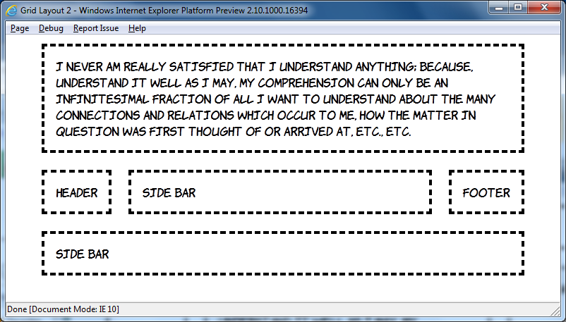
I want you to reflect, now, on all the fun you've had over the last ten years constructing CSS layouts of three equal height columns, with a header and footer, and making them work in IE6. Layouts something like this:
Are you remembering all the fun you had? Good, now look at this markup and contemplate how you'd turn it into a three column layout:
<header>Header</header> <aside class="b">Side bar</aside> <article>I never am really satisfied...</article> <aside class="d">Side bar</aside> <footer>Footer</footer>
Now look at this CSS and start wishing the future would arrive soon:
body { width: 90%; margin: 0 5%; display: -ms-grid; -ms-grid-columns: auto minmax(min-content, 1fr) auto; -ms-grid-rows: auto minmax(min-content, 1fr) auto; } article, aside, header, footer { margin: 1em; padding: 1em; outline: 4px dashed black; } header { -ms-grid-column: 1; -ms-grid-row: 1; -ms-grid-column-span: 3; } aside.b { -ms-grid-column: 1; -ms-grid-row: 2; } article { -ms-grid-column: 2; -ms-grid-row: 2; } aside.d { -ms-grid-column: 3; -ms-grid-row: 2; } footer { -ms-grid-column: 1; -ms-grid-row: 3; -ms-grid-column-span: 3; }
That's it, seven declarations is all you need for that three column layout with CSS Grid Align. For this first example I'm going to step through the key points line by line:
display: -ms-grid;
This is the bit which declares we will use the grid layout manager on the children of this element, in the same way that the flexbox layout manager was declared above with display: -ms-box.
-ms-grid-columns: auto minmax(min-content, 1fr) auto;
This line defines three columns, the first and last will shrink to fit the content - that's the default behaviour, similar to a table. The middle column will be a minimum of min-content, which is basically the same as auto, and a maximum of 1fr which is a 'fraction of available space' - quite similar to a flex unit and, since there's only one fractional column, basically equivalent to all the available space.
-ms-grid-rows: auto minmax(min-content, 1fr) auto;
We'll have three rows to go along with our three columns, I won't go over the individual values again. Now the fun stuff:
header { -ms-grid-column: 1; -ms-grid-row: 1; -ms-grid-column-span: 3; }
Put the header in the first column of the first row, and make it span three columns. That's it. Really, it's that simple. Let's just do one more:
article { -ms-grid-column: 2; -ms-grid-row: 2; }
Put the article in the second column and the second row. And make me some coffee, white, no sugar. Actually there isn't a CSS property for that yet, maybe CSS4...
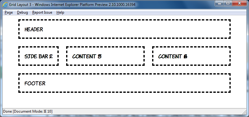
But it gets more cool than that. In the example above the order of the elements in the markup matched up with the order they were placed into the grid, but it doesn't have to be that way:
This amazing transformation was achieved without any changes in markup, just messing around with CSS:
header { -ms-grid-column: 1; -ms-grid-row: 2; } aside.b { -ms-grid-column: 2; -ms-grid-row: 2; } article { -ms-grid-column: 1; -ms-grid-row: 1; -ms-grid-column-span: 3; } aside.d { -ms-grid-column: 1; -ms-grid-row: 3; -ms-grid-column-span: 3; } footer { -ms-grid-column: 3; -ms-grid-row: 2; }
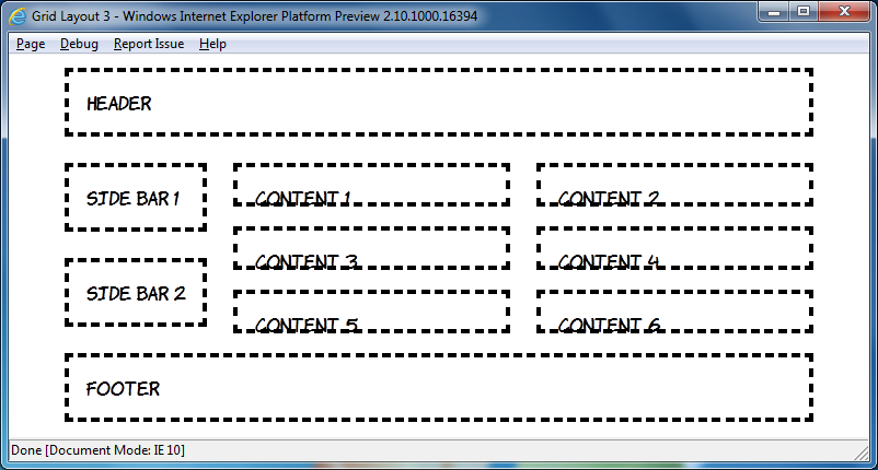
In the current draft there's a grid-cell-stacking property which will let you flow multiple elements into a single cell, but in the IE10PR1 implementation things just stack on top of each other:
This is a shame, because the markup is quite straightforward, I won't post all of it because this is already getting quite long (have a look), but here's the nice bit:
article:nth-child(2n+1) { -ms-grid-column: 1; } article:nth-child(2n) { -ms-grid-column: 2; }
The article elements are assigned to grid cells alternately, unfortunately it doesn't work yet. However you can nest elements set to display: -ms-grid inside each other:
Have a look at the source code for that one, it gets pretty hairy, so rather than try and do that sort of thing it's probably best to use some wrapper elements like this:
Again, view the source code yourself to see how it's put together, but I think these things will be worth re-visiting in a later preview release.
I'm going to finish off with some adaptive layout. Grid Align is a great fit for this because of the complete independence of layout from source order. Here's what I put together based off the previous example at 800 pixel width:
Now here's the same page at 640 and 480 pixel widths:
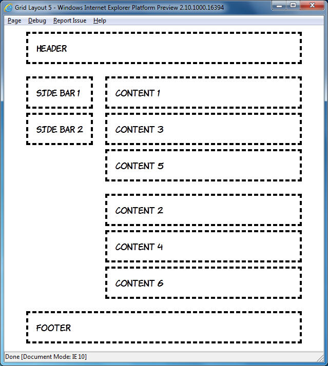
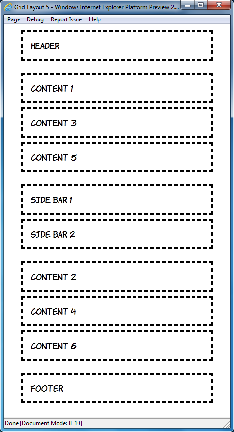
The markup is, of course, the same in each case:
<header>Header</header> <div id="sidebar"> <aside>Side bar 1</aside> <aside>Side bar 2</aside> </div> <div id="content1"> <article>Content 1</article> <article>Content 3</article> <article>Content 5</article> </div> <div id="content2"> <article>Content 2</article> <article>Content 4</article> <article>Content 6</article> </div> <footer>Footer</footer>
By default I've assumed a single column layout:
body { width: 90%; height: 90%; margin: 0 5%; display: -ms-grid; -ms-grid-rows: auto; -ms-grid-columns: 1fr; } article, aside, header, footer { margin: 1em; padding: 1em; outline: 4px dashed black; } header { -ms-grid-row: 1; } #sidebar { -ms-grid-row: 3; } #content1 { -ms-grid-row: 2; } #content2 { -ms-grid-row: 4; } footer { -ms-grid-row: 5; }
Moving on to windows of a minimum width of 600 pixels, move up to two columns:
@media screen and (min-width: 600px) { body { -ms-grid-columns: auto 1fr; -ms-grid-rows: auto 1fr 1fr auto; } header { -ms-grid-column: 1; -ms-grid-row: 1; -ms-grid-column-span: 2; } #sidebar { -ms-grid-column: 1; -ms-grid-row: 2; -ms-grid-rowspan: 2; } #content1 { -ms-grid-column: 2; -ms-grid-row: 2; } #content2 { -ms-grid-column: 2; -ms-grid-row: 3; } footer { -ms-grid-column: 1; -ms-grid-row: 4; -ms-grid-column-span: 2; } }
This is nothing you haven't seen already, but I'll just point out again how cool it is that you can place the elements wherever you want them. Finally, for windows of greater than 760 pixels width, switch back to the three column layout:
@media screen and (min-width: 760px) { body { -ms-grid-columns: auto 1fr 1fr; -ms-grid-rows: auto 1fr auto; } header { -ms-grid-column: 1; -ms-grid-row: 1; -ms-grid-column-span: 3; } #sidebar { -ms-grid-column: 1; -ms-grid-row: 2; } #content1 { -ms-grid-column: 2; -ms-grid-row: 2; } #content2 { -ms-grid-column: 3; -ms-grid-row: 2; } footer { -ms-grid-column: 1; -ms-grid-row: 3; -ms-grid-column-span: 3; } }
If you've downloaded the IE10 developer preview have a play round with it yourself, and try not to think about how long you'll have to wait until all this stuff is available in production browsers
01/31/11
Categories: Front End Web Development, Blogging and Internet Culture
Client Side Server Side Includes
I spent some time over Xmas reflecting on my past web adventures. My first ever website, a guide to local drinking establishments, was hosted on a cast-off server at Edinburgh University in late 1993, and the particular server and site are now long gone (although the server has been replaced). Similarly, my original mid-nineties home page, replete with animated GIFs and ripped off Homer Simpson images has also be consigned to the recycle bin of web history (thankfully). However, the first website I worked on 'professionally' is still online: iwant2bhealthy.com is a thousand page static HTML monolith which we maintained with Dreamweaver 3.
The site did take advantage of some server processing, it used Server Side Includes (SSI) to embed particular common items such as the main navigation and footer. SSI isn't so common these days when nearly every cheap host offers some sort of server side scripting language, so often it isn't turned on my default. The result is that the iwant2bhealthy.com website is missing its main navigation and footer on most pages, all that's left is some markup like this:
<!--#include virtual="/Library/mainmenu.shtml" -->
Or this:
<!--#include virtual="/Library/footer.shtml" -->
I had a hankering to experience the website in all its turn of the century glory and it seemed to me that I ought to be able write a bookmarklet to grab jQuery, grab the comments, fetch the includes with AJAX and insert them in place of the comments.
It turns out that the first tricky thing is grabbing the comment elements. The jQuery selection engine purposely ignores comments so none of those handy little methods are much use. There's not much option but to loop through the document and select based on nodeType (8 for a comment element), fortunately someone on the web had already done most of the hard work so I was able to adapt his code:
parseSSI : function(el) { var nodes = el.childNodes; var l = nodes.length; while (l--) { current = nodes[l]; if (current.nodeType == 8) { //do stuff here } else if (current.nodeType != 3 && current.childElementCount > 0) { this.parseSSI(current); } } }
The function loops through all the child nodes of a supplied element and, if they're a comment, does some processing. If the node isn't a comment we check that it's also not a text node and then call the function recursively if there are any child nodes.
Of course it's entirely possible that there are comments in the web page that have nothing to do with server side includes, so some sort of check is probably in order. Following James' example I used a regular expression:
re : /#include virtual=\"(.*)\"/i
My next step was to convert those comment elements into something that could be more easily manipulated by jQuery, so I decided to convert them to links:
var match = this.re.exec(current.data); if (match != null) { var a = document.createElement('a'); a.href = match[1]; current.parentNode.replaceChild(a, current);
Now we're back in the nice, succinct land of jQuery - fetch the URL with Ajax and replace the relevant link element in the callback:
$.ajax({ url: match[1], success: function(data, textStatus, XMLHttpRequest){ $('[href=' + this.url + ']').replaceWith(data); }});
Try out the final code here.
12/24/10
Categories: Web Develop, Blogging and Internet Culture
HTML5 Comment Forms in b2evolution
Following my post last week on HTML5 forms it occurred to me that I should be a little embarrassed devoting all this time to writing about HTML5 when my blog makes use of no HTML5 features. A quick hack around with the template corrected the DOCTYPE and I was looking for some other quick changes I could make without getting into to a full redesign (currently in process for about 5 months...). The comments form seemed an obvious target and turns out to be remarkably easy to do in b2evo.
The file you need to edit is _item_comment_form.inc.php, which will live inside your skins directory. If you have a custom skin set up you may also find inside the directory for that skin, these instructions assume you'll be editing the standard _item_comment_form.inc.php, whether in the skins directory or in a folder in that directory.
The parts we need to edit are on lines 142 and 143, the fields for email and website address:
$Form->text( 'i', $comment_author_email, 40, T_('Email'), '<br />'.T_('Your email address will <strong>not</strong> be revealed on this site.'), 100, 'bComment' ); $Form->text( 'o', $comment_author_url, 40, T_('Website'), '<br />'.T_('Your URL will be displayed.'), 100, 'bComment' );
The text method on the $Form object can take an optional sixth parameter which determines the input type. So to create HTML5 email and url inputs, simply add that sixth parameter:
$Form->text( 'i', $comment_author_email, 40, T_('Email'), '<br />'.T_('Your email address will <strong>not</strong> be revealed on this site.'), 100, 'bComment', 'email' ); $Form->text( 'o', $comment_author_url, 40, T_('Website'), '<br />'.T_('Your URL will be displayed.'), 100, 'bComment', 'url' );
12/16/10
Categories: Front End Web Development, Standards, HTML and CSS
Fun with HTML5 Forms
There have been many blog posts describing all the new elements and input types HTML5 provides, check out this 24ways post for a good summary, or you could even read chapter 3 of my book. In this post I'm going to focus instead on the validation API and some related HTML5 features by building a simple game based on entering an email address. The goal is to explore some HTML5 features rather than do everything in the most straightforward way, but there should be some practically useful code snippets.
The form itself is going to be very straightforward:
<form id="game"> <fieldset> <legend>Enter a valid email address before the timer runs down</legend> <label for="email">Email</label> <input id="email" type="email" autofocus required> </fieldset> <label for="countdown">You have <output id="countdown">10</output> seconds. </label> <label for="score">You have <output id="score">0</output> points. </label> </form>
In the initial version we will take advantage of three HTML5 features:
- The
outputelement - The
emailinput type - The
checkValiditymethod from the the HTML5 Form Validation API
In the countdown function we use the value property of the the output element The output element is something like a span, it's a start and end tag with arbitrary content, but you can access the contents using the value attribute like a form field :
var counter = function (cd, sc, em) { cd.value -= 1; sc.value = calcScore(em.value); }
This may not look particularly helpful, but consider what the code would look like without the output element (or in a browser which doesn't support output):
var counter = function (cd, sc, em) { var count = cd.innerHTML; count -= 1; cd.innerHTML = count; sc.innerHTML = calcScore(em.innerHTML); }
The function is now mostly about the details of manipulating the DOM, rather than the more straightforward algebraic style of the original. Granted, libraries like jQuery have for a long time provided abstractions which allow you to write this code more cleanly but, like design patterns, these are as much an indication of the lack of expressiveness in the underlying platform as they are examples of best practice.
The game needs a function to calculate a 'score' from the email address. This is, of course, completely arbitrary:
function calcScore(email) { var s = 0; s += email.length; s += email.indexOf('@')>-1?email.indexOf('@'):0; s += email.lastIndexOf('.')>-1?email.lastIndexOf('.'):0; return s; }
Now we need to wire up the functions to appropriate events when the game starts. To keep things simple I'm going to store a reference to the interval in a global variable:
var cdInterval; var gameStart = function () { window.clearInterval(cdInterval); var em = document.getElementById('email'); var cd = document.getElementById('countdown'); var sc = document.getElementById('score'); cd.value = 10; sc.value = 0; em.value = ''; em.readOnly = false; cdInterval = window.setInterval(counter,1000, cd, sc, em); window.setTimeout(gameOver,10000, cd, sc, em); }
Again, this function takes advantage of the value attribute on the output elements. The last line calls a gameOver function after ten seconds, we'll use that to clear the interval and calculate the score. The checkValidity method of the email field will be used to determine if the email address is currently valid:
var gameOver = function (cd, sc, em) { window.clearInterval(cdInterval); var score = calcScore(em.value); if (!em.checkValidity()) { score = 0; window.alert("You lose!"); } cd.value = 0; sc.value = score; em.readOnly = true; }
The checkValidity() method is part of the HTML5 validation API, it returns true if the browser understands the contents of the field as a valid email. Note that we are able to call this method without submitting the form, so it is easy to hook form submission into a custom validation function if we want. At no point do we have to implement any code to determine what a valid email address would be. This is a second major saving, have a look at this regular expression example if you thought that code was straightforward:
(?:[a-z0-9!#$%&'*+/=?^_`{|}~-]+(?:\.[a-z0-9!#$%&'*+/=?^_`{|}~-]+)*|"(?:[\x01-\x08\x0b\x0c\x0e-\x1f\x21\x23-\x5b\x5d-\x7f]|\\[\x01-\x09\x0b\x0c\x0e-\x7f])*")@(?:(?:[a-z0-9](?:[a-z0-9-]*[a-z0-9])?\.)+[a-z0-9](?:[a-z0-9-]*[a-z0-9])?|\[(?:(?:25[0-5]|2[0-4][0-9]|[01]?[0-9][0-9]?)\.){3}(?:25[0-5]|2[0-4][0-9]|[01]?[0-9][0-9]?|[a-z0-9-]*[a-z0-9]:(?:[\x01-\x08\x0b\x0c\x0e-\x1f\x21-\x5a\x53-\x7f]|\\[\x01-\x09\x0b\x0c\x0e-\x7f])+)\])
Finally, start the game when the page loads:
window.addEventListener('load', gameStart, false);
The first version of the game will work in Opera, and the development versions of Firefox (4 - relevant bugs are 345624 and 346485 ) and Chrome (9 - relevant bugs are 27452 and 29363). If you want it to work on older versions of Chrome and Safari then you'll need to replace the output based syntax with the innerHTML approach as per the alternate version of counter above.
For the second iteration we're going to look at these two features:
- Using the pageshow event from the History API
- How to reset
outputelements
If the user visits another page after completing the game and then goes back then the game will sit there inert until you reload the page. This is because the game logic hangs off the onload event, and navigating forward and backwards in the browser history doesn't fire onload. The HTML5 History API gives us another option: the onpageshow event. This fires whenever a page is displayed rather than when it is loaded. There is currently support for onpageshow in Firefox and Chrome, but not in Opera, so we'll use the iseventsupported script to detect support and fall back to onload if it's not available:
if (isEventSupported('pageshow')) { window.addEventListener('pageshow', gameStart, false); } else { window.addEventListener('load', gameStart, false); }
We'll also do some extra work in the gameStart function to clear and reinstate the timeout and, since the autofocus attribute gets ignored in onpageshow, focus the input field:
var gameStart = function () { window.clearInterval(cdInterval); window.clearTimeout(cdTimeout); var em = document.getElementById('email'); var cd = document.getElementById('countdown'); var sc = document.getElementById('score'); cd.value = 10; sc.value = 0; em.value = ''; em.readOnly = false; cdInterval = window.setInterval(counter,1000, cd, sc, em); cdTimeout = window.setTimeout(gameOver,10000, cd, sc, em); em.focus(); }
Missing from the first version of the game is any way to restart or replay. Let's start off by adding a reset button to the form:
<input id="restart" type="reset" value="New Game">
There are some obvious issues with this, not least that the form reset isn't going to remove the countdown and game over timeouts. However, rather than deal with that by hooking the event in a sensible way, we're going to take this opportunity to investigate an interesting feature of the output element, the defaultValue.
If you try clicking the reset button as it stands, this is what happens to the two output elements:

The output element is something of a hybrid. Although it can be created, declaratively, in markup, it isn't really any use without JavaScript. While not a direct consequence of this state of affairs, it therefore doesn't matter that there's no way to set the default value of an output element in the HTML, you have to do it with JavaScript using the defaultValue property in the DOM. Let's add a function to set up these fields correctly which will be run onload:
var gameSetup = function() { document.getElementById('countdown').defaultValue = "10"; document.getElementById('score').defaultValue = "0"; document.getElementById('restart').addEventListener('click', gameStart, false); }
You'll note that there's also an onclick handler added to the button to restart the game. The reason we don't want to capture the form reset event itself is that we're going to use the form reset method within gameStart. These three lines of code:
cd.value = 10; sc.value = 0; em.value = '';
Will become this one line of code:
document.getElementById('game').reset();
But now resetting the form will restore the output fields to their defaultValue, as can been seen in the second checkpoint:

For the third iteration we're going to concentrate on user feedback. This is going to involve both HTML5 and CSS3:
- Using the
onforminputevent to update the score immediately - Giving instant feedback on the current validity of the email with CSS3
So far feedback to the user happens every second, in the counter function. Instead of updating the the score every second let's update it every time the input changes. There are a number of options in HTML4 already for handling this - we could attach an event to the email field and monitor it for changes, however HTML5 (for now) presents us with another option: onforminput. Instead of being associated with the input field, the item being updated, onforminput can be associated with the output element, the item we want to update:
document.getElementById('score').addEventListener('forminput', updateScore, false);
Because the output element is the target, the update score function looks like this:
var updateScore = function(ev) { ev.target.value = calcScore(document.getElementById('email').value); }
Unfortunately it seems that onforminput may be dropped from HTML5, so we'd better check for support and fall back to capturing any oninput event on the whole form through event bubbling:
if (isEventSupported('forminput')) { document.getElementById('score').addEventListener('forminput', updateScore, false); } else { document.getElementById('game').addEventListener('input', updateGlobalScore, false); }
This does complicate the function to update the score as the target of the event is no longer the output element, it's whatever input element has been updated. At least in our simple case there's only one input element so we can use the ev.target shortcut, just on the other side of the assignment:
var updateGlobalScore = function(ev) { document.getElementById('score').value = calcScore(ev.target.value); }
If you've been following along in Firefox you will have seen that both provide some default styling for invalid fields:

However Chrome (top) and Opera (bottom) don't show any indication:


Let's apply some styles explicitly to make everything consistent across browsers:
input[type=email]:invalid { box-shadow: none; background-color: rgba(255,0,0,0.5); } input[type=email]:valid { box-shadow: none; background-color: rgba(0,255,0,0.5); }
The box-shadow overrides the Firefox default, while the background-color will be applied in all three browsers, as you can see in the third checkpoint.
The game is now functionally complete, but before we wrap this up I'd like to use one further iteration to examine the checkValidity method more closely. Here's what the spec says about checkValidity:
Returns true if the element's value has no validity problems; false otherwise. Fires an invalid event at the element in the latter case.
We only perform additional work so, instead of using the boolean return value of the function to guide or logic, we could make the end of the game event driven. First we'll simplify the gameOver function, as all we need to do there now is ensure the event gets triggered if the email is invalid (and, thanks to onforminput, we know the score will always be up to date):
var gameOver = function (cd, sc, em) { window.clearInterval(cdInterval); cd.value = 0; em.checkValidity(); }
Now we need to declare an function to handle the oninvalidevent, I've chosen to name it in tribute to cheesy European rock:
var theFinalCountdown = function(e) { document.getElementById('score').value = 0; window.alert("You lose!"); e.target.readOnly = true; }
Then we attach it to the oninvalid of the email field:
document.getElementById('email').addEventListener('invalid', theFinalCountdown, false);
Thus concludes my slightly erratic tour through HTML5 form features with the final checkpoint. If you've enjoyed this please check out the more extensive introduction to HTML5 Forms in Chapter 3 of my book.
11/15/10
Categories: Front End Web Development, Standards, HTML and CSS
Hello! HTML5 and CSS3 - 50% Off Until 16th December
Buy early access to my book Hello! HTML5 and CSS3 and get a 50% discount for the next month with the code html550. Coming soon will be the chapter on HTML5 Forms, which should be pretty useful for getting up to speed in time for the release of Firefox 4.
07/20/10
Firefox 4.0 Features for Font Fanatics
If you're following the development of CSS3 you may have seen, last June, a proposal from John Daggett of Mozilla to bring advanced typography control to the web. A few months later we saw some experimental Firefox builds which demonstrated the features. The terminology has been through a slight update since then, from font-feature-opentype to font-feature-settings, but last week these experiments finally made their way into the trunk builds of Firefox 4.0 on Windows and Mac.
Even though it doesn't yet work under Linux, I thought it was time to start investigating. In this post I'm going to have a look at what these features can look like, mostly following the examples from the October Mozilla Hacks blog post put using the Calluna Regular font. Then I'll show how to turn them on and off in Firefox with CSS, and find the various features using a font editor.
Open Type Font Features
A font is a collection of glyphs, graphical representations of letters, which are associated with characters. Font features are a scheme for getting alternative glyphs for a given character or sequence of characters. The full list of open type features is available in the spec. Each feature is associated with a four character identifier and can be set to on (1) or off (0), here's an example CSS rule:
.example { font-feature-settings: "dlig=1,tnum=1,ss01=1"; }
In the current Firefox 4.0 nightly builds you can enable support for the features below by setting the gfx.font_rendering.harfbuzz.level preference to 1 in about:config.
Ligatures
Ligatures are special glyphs which replace runs of commonly occurring characters. There are two levels of ligatures, the standard ligatures are turned on by default in Firefox 4.0. To the left is an example in Calluna. The image on the left is from Firefox 3.6, on the right is Firefox 4.0, you can see the slight different where the two characters connect at the top. the combined glyph is also slightly narrower but that's quite hard to stop.
The second example is slightly more obviously different, though with Calluna being a refined font they're still quite subtle. Again it's Firefox 3.6 on the right and 4.0 on the left, the first 'f' is noticeably smaller than the standard one and there's a single bar across both 'f' characters.
There are some ligatures which don't map to commonly occurring sequences of characters (I know fb might not strike you as particularly common, but there are at least 26 just in English). Calluna has two whole sets of arrow glyphs which replace sequences like '-->>' and '-->', more examples to the right.
So in Firefox 4.0, if the font being used supports standard ligatures, you'll see them. If you want to give directions to Firefox users which will appear like random sequences of dashes and greater thans to everyone else you now can. But that's not all! There's also a more decorative set of combinations called discretionary ligatures. Here's some examples, normal on the left, discretionary ligatures on the right:
The point of all this is, of course, that it can all be controlled through CSS. I've constructed an example sentence which could easily occur in conversation at any time and just so happens to contain plenty of words which show off our ligatures. First, let's see what it looks like with everything disabled:
Here's the code to disable the standard ligatures in Firefox 4.0 using -moz-font-feature-settings:
.alloff { -moz-font-feature-settings: "liga=0"; }
The ligature feature is called liga. As I mentioned above, we can set it to 1 to enable (which is the default in Firefox 4.0) and 0 to disable. For comparison let's have a look at the standard Firefox 4.0 rendering:
The CSS for this is straightforward as, of course, there isn't any:
.normal { /* it's normal, no setting required...*/ }
Now let's turn on the discretionary ligatures:
The discretionary ligature feature is called dlig, again it's 1 to enable and 0 to disable:
.allon { -moz-font-feature-settings: "dlig=1"; }
It could be that, for some reason, you want the discretionary ligatures but not the standard ones:
Probably not much point with Calluna, but perhaps with a more decorative typeface this would be useful. You can pass several features to -moz-font-feature-settings in a comma separated list:
.discretionary { -moz-font-feature-settings: "liga=0,dlig=1"; }
How do you go about finding all these ligatures, standard or discretionary? I used FontForge because it was easily installable on my laptop using yum, the interface is a bit archaic but it seems perfectly functional. Here's what it looks like after I've opened up the Calluna font:
On the view menu there's a combinations sub-menu upon which the ligatures option lives:
Now you have a list of ligatures to choose from:
I opened up the 'ffb' ligature:
Now go to the view menu again and look up the Glyph Info option:
In the resulting dialogue you can see that 'ffb' is part of the set of standard ligatures:
If instead I open up the 'sk' glyph you can see this is part of the discretionary ligature set:
Numerals
Now that we've had some fun with ligatures you may be wondering what other cool tricks are hidden inside open type fonts. One very practical feature is different styles of numbers. Quick pop quiz time, which is the highest number in the screenshot below?

Did you guess it was the second one, or did you have to count carefully? Numbers by default are proportionally spaced, which looks nice when they appear in text but can be misleading when looking at tables of figures. But now, thanks to -moz-font-feature-settings, we have some other options:

The numbers are now using tabular alignment - each number glyph is an equal width. Tabular numerals use the tnum feature:
.tabular { -moz-font-feature-settings: "tnum=1"; }
There are a few other number features. The default numbers in Calluna are 'old style' (onum), you can see there's quite a lot of variance caused by the descenders and ascenders going above and below the line. The alternative to that is 'lining figures' (lnum):

As you can see, they give a much more consistent line shape. And you can also have tabular, lining numerals:

.tabular-lining { -moz-font-feature-settings: "lnum=1,tnum=1"; }
Once again you can find all these alternatives in FontForge in the Glyph Info window:
Before we finish up with numbers, two more features are worth mentioning. You can control whether or not the zero is 'slashed' with the zero feature:

The bottom number has -moz-font-feature-settings: "zero=1"; applied. You can also enable fractions with the frac feature setting:

Stylistic Alternatives
There's plenty more stuff in the open type spec, there are 134 different features listed in the spec I linked to in the introduction. The really fancy bits of fonts are often in the twenty 'stylistic sets' ss01 to ss20. You can find what options you may have in FontForge for a particular font by looking for the display substitutions option on the view menu:

You then get a dialogue with a list of the options:

From which you can see that Calluna only has glyphs for one of the stylistic sets, and when you select ss01 you'll see that there's not a lot of (regular) characters in that:
And there's more...
There's plenty of other interesting stuff wrapped up in open type font feature settings, we haven't yet discussed swashes, contextual alternates or historical forms for just three examples, but I'll leave exploring those as an exercise for the reader.
Practical Considerations
It may seem slightly superfluous for me to mention this about a CSS feature which, so far, has only an experimental implementation in just one browser, but it would be unwise to build a site which depended on font-feature-opentype, for example by relying on certain ligatures or stylistic sets to convey information. However, for making your typography look a bit nicer for a subset of your users, this stuff will be usable on real web pages from the day of Firefox 4.0's release.
The Future
Now you're salivating for a future where all web browsers support font-feature-settings this is probably a good time to point out that, once that support exists, you'll hardly ever use it
No, this is not a trick, font-feature-settings itself is only intended to be used for obscure and little used options in the open font features list, the common stuff will be accessible through new values on the font-variant property as well as several font-variant-* properties. The current level of support in Firefox is really only to see how things will look once all that gets implemented.
Let's have a look at how a future you will be recreating my examples with the proposed font-variant property extensions. First, discretionary ligatures:
.discretionary { font-variant: additional-ligatures; }
Alternatively we cold use the specific ligatures property:
.discretionary { font-variant-ligatures: additional-ligatures; }
Each value has a corresponding no-* version, so you could specify no-common-ligatures to turn off the common ones, or no-additional-ligatures in order to override the above rule further down the inheritance chain. What about lining, tabular numerals?
.tabular-lining { font-variant-numeric: lining-nums tabular-nums; }
None of this is implemented yet, so I can't test I've got it right, and all this syntax is still subject to change as the fonts module is still a working draft, so I'll stop there. Hopefully this has given you some ideas for fancy typography to give Firefox 4.0 users a special treat and will set you off on your own investigations.
06/30/10
Attempting Better Drop Shadows in IE8 - Filters Revisited
I was reading about cssSandpaper today and my curiosity was sparked by this line:
Note that in IE, the blur-radius is not currently not supported, due to a lack of support in IE’s DropShadow filter.
This is true, DropShadow doesn't support blur radius. The alternative Shadow filter does have a blur radius like property, Strength, which "Sets or retrieves the distance, in pixels, that a filter effect extends."

So there are two basic options, both with their own advantages and disadvantages:
- DropShadow - you can use alpha transparent colours and specify separate offsets, but the colour remains solid and sharp edged
- Shadow - you can specify a blur radius type property but you cannot set separate x and y offsets, the colour will fade to transparent but you have no control over it, and the results also remain solid and sharp edged
Basically, drop shadows in IE look like they were designed by developers rather than graphic designers, see for yourself in the example to the right - top is DropShadow, bottom is Shadow, hard edges in both cases.
Many, like myself, have taken the position that this can't be helped, we should be grateful to be able to do drop shadows at all in CSS for IE, and just picked one of the two options and got on with things. However, at least in IE8, there may be some further options which are worth investigating. The following text is on every MSDN filter page:
You can assign multiple filters or transitions to an object by declaring each in the filter property of the object.
And guess what? There is a Blur filter and, if that turns out to be no good, there's also a MotionBlur and a Glow which we may be able to do something with. So my strategy in this post is to apply some of these in combination with DropShadow and Shadow to see if we can get slightly more natural looking CSS drop shadows in Internet Explorer. First, lets remind ourselves what an IE drop shadow looks like:
And here's the code:
<div style="position: relative; height: 30px; filter: progid:DXImageTransform.Microsoft.DropShadow(OffX=6, OffY=4, Color='gray') ">Straight drop shadow example</div>
Let's try adding a blur to that and see what happens:
As you can see, the blur effect applies to the shadow but it also applies to the contents.
<div style="position: relative; height: 30px; filter: progid:DXImageTransform.Microsoft.DropShadow(OffX=6, OffY=4, Color='gray') progid:DXImageTransform.Microsoft.Blur(pixelradius=2)"> 0 Example text, should not have shadow or be blurred.</div>
I wondered if I could wrap the contents in another element and protect it somehow from the filter.
A shadow on an element with a transparent background will produce a text shadow, while a background colour will cause the shadow to apply to the box. So I thought it was worth a try, and I thought I'd trigger hasLayout to be on the safe side:
<div style="height: 30px; filter: progid:DXImageTransform.Microsoft.DropShadow(OffX=6, OffY=4, Color='gray') progid:DXImageTransform.Microsoft.Blur(pixelradius=2)"> <span style="height: 30px; zoom:1; background-color: #fff;"> 1 Example text, should not have shadow or be blurred.</span></div>
Not much joy there, but I did have a bit better luck with the next attempt:
By making the child element absolutely positioned the filters were now ignored on the containing element, of course the containing element is now empty so needs an explicit height to keep it open:
<div style="position: relative; height: 30px; filter: progid:DXImageTransform.Microsoft.DropShadow(OffX=6, OffY=4, Color='gray') progid:DXImageTransform.Microsoft.Blur(pixelradius=2)"> <span style="position: absolute; height: 30px; zoom:1; background-color: #fff;"> 2 Example text, should not have shadow or be blurred.</span></div>
The problem is that the span now pokes out of the containing div, so I tried fitting it more exactly:
Quite a lot of additional markup is now getting tacked on, for really not much aesthetic benefit. Having the absolutely positioned child match the dimensions of the containing div does mean that you can cover up the blurry top and left edges, but the tradeoff is the elements need to have known dimensions.:
<div style="position: relative; height: 30px; filter: progid:DXImageTransform.Microsoft.DropShadow(OffX=6, OffY=4, Color='gray') progid:DXImageTransform.Microsoft.Blur(pixelradius=2)"> <span style="position: absolute; top: 2px; left: 2px; height: 30px; width: 100%; display: inline-block; background-color: #fff;"> 3 Example text, should not have shadow or be blurred.</span></div>
Since the shadow still looks crappy I thought I'd try a few different combinations. Motion blur:
And the code:
<div style="position: relative; height: 30px; filter: progid:DXImageTransform.Microsoft.Dropshadow(OffX=6, OffY=4, Color='gray') progid:DXImageTransform.Microsoft.MotionBlur(direction=135,strength=8,add=true)"> <span style="position: absolute; height: 30px; width: 100%; display: inline-block; background-color: #fff;"> 4 Example text, should not have shadow or be blurred.</span></div>
Glow:
More code:
<div style="position: relative; height: 30px; filter: progid:DXImageTransform.Microsoft.Dropshadow(OffX=6, OffY=4, Color='gray') progid:DXImageTransform.Microsoft.Glow(strength=2,Color='gray')"> <span style="position: absolute; top: 1px; left: 1px; height: 30px; width: 100%; display: inline-block; background-color: #fff;"> 5 Example text, should not have shadow or be blurred.</span></div>
What about just applying multiple drop shadows?
The above image combines four:
<div style="position: relative; height: 30px; filter: progid:DXImageTransform.Microsoft.Dropshadow(OffX=4, OffY=4, Color=#cc999999) progid:DXImageTransform.Microsoft.Dropshadow(OffX=4, OffY=4, Color=#99999999) progid:DXImageTransform.Microsoft.Dropshadow(OffX=4, OffY=4, Color=#66999999) progid:DXImageTransform.Microsoft.Dropshadow(OffX=4, OffY=4, Color=#33999999)"> <span style="position: absolute; height: 30px; width: 100%; display: inline-block; background-color: #fff;"> 6 Example text, should not have shadow or be blurred.</span></div>
Getting a bit far out now, multiple drop shadows and blur:
<div style="position: relative; height: 30px; filter: progid:DXImageTransform.Microsoft.Dropshadow(OffX=4, OffY=4, Color=#cc999999) progid:DXImageTransform.Microsoft.Dropshadow(OffX=4, OffY=4, Color=#99999999) progid:DXImageTransform.Microsoft.Dropshadow(OffX=4, OffY=4, Color=#66999999) progid:DXImageTransform.Microsoft.Dropshadow(OffX=4, OffY=4, Color=#33999999) progid:DXImageTransform.Microsoft.Blur(pixelradius=2)"> <span style="position: absolute; height: 30px; width: 100%; display: inline-block; background-color: #fff;"> 7 Example text, should not have shadow or be blurred.</span></div>
Enough of that, I thought I'd try a few examples with shadow instead of drop shadow:
The basic shadow fades out but, as I mentioned, is sharp edged.
<div style="position: relative; height: 30px; filter: progid:DXImageTransform.Microsoft.Shadow(Direction=135, Strength=5, Color='gray')"> Straight shadow example</div>
Now a shadow with a blur:
<div style="position: relative; height: 30px; filter: progid:DXImageTransform.Microsoft.Shadow(Direction=135, Strength=5, Color='gray') progid:DXImageTransform.Microsoft.Blur(pixelradius=2)"> <span style="position: absolute; top: 2px; left: 2px; height: 30px; width: 100%; display: inline-block; background-color: #fff;"> 3 Example text, should not have shadow or be blurred.</span></div>
A shadow with motion blur:
And with glow:
Yes, they all still look a bit pants.
So it seems like Shadow and Blur in combination may be the best of a bad bunch, and they don't really give you too many advantages: you have to know the dimensions of the element in advance for it to be useful in CSS; you might be able to work a jQuery plugin out of it, but if you're going to rely on scripting you might as well make use of once the image based solutions which result in nicer looking shadows; and finally, all of the above only works in IE8 - IE7 applies all the filters to the contained element whether it's positioned or not. So, wasted effort? Possibly, at least now I know for sure, here's hoping IE9 adds support for box-shadow ![]()
05/31/10
London Web Standards: Beautiful Design for Everyone with Ann McMeekin
Review: LWS May: Beautiful Design for Everyone at The Melton Mowbray, 18 Holborn, EC1N 2LE, London 19:00 to 20:30
This event was originally going to be a double act, but Antonia Hyde unfortunately had to pull out. We were fortunate to have someone of the calibre of Ann McMeekin to pick up the slack. Ann had some very beautiful slides and spent a lot of time talking about each one, I made some necessarily limited notes from which I will attempt to reconstruct the gist of what she said (hopefully I don't misrepresent anything too badly!) and tried to locate some of the pictures from the presentation to give the flavour of it.
Ann began by talking about her background as an accessibility consultant, which she initially thought would be her dream job but, over time, she came to realize that what she really valued was not great accessibility but great design. Great design, of course, includes accessibility, but the focus is not on a check-list of requirements but the overall experience each user will have.
While accessibility is a widely accepted goal, honest discussion about it is often difficult as many people find talking about disability uncomfortable. A common reaction when seeing for the first time the rigmarole a screen reader user has to go through to get useful information out of some websites, is to feel empathy and start thinking how terrible it must be to put up with that, which leads immediately to that uncomfortable feeling. However, to provide accessible design solutions we must get past the stage of empathy in order to develop understanding about what tools we need to provide. Disabled people are not passively waiting for us to make their lives better, they just want the tools to make a better life for themselves.
Next Ann showed us a segment from a TED talk by Aimee Mullins. Aimee, who had her lower legs amputated as a child, famously competed in the 1996 Paralympics on a set of carbon fibre 'cheetah legs' (this TED talk includes a description of her experiences at the games) and has since gained fame as a speaker, model and actress. Aimee talked about her collection of prosthetic legs and the different abilities and attributes each provided her with, like the cheetah legs for running or the set she was wearing for the talk which added six inches to her normal height:
I have a variable of five different heights. (Laughter) Today, I'm 6'1". And I had these legs made a little over a year ago at Dorset Orthopaedic in England and when I brought them home to Manhattan, my first night out on the town, I went to a very fancy party. And a girl was there who has known me for years at my normal 5'8". Her mouth dropped open when she saw me, and she went, "But you're so tall!" And I said, "I know. Isn't it fun?" I mean, it's a little bit like wearing stilts on stilts, but I have an entirely new relationship to door jams that I never expected I would ever have. And I was having fun with it. And she looked at me, and she said, "But, Aimee, that's not fair."
For Aimee the loss of her lower legs is not so much a disability as an opportunity. And the opportunity isn't just to 'be normal', whatever that may mean, she can exceed normal.
She doesn't see herself as limited, and so she isn't limited (from another TED talk by Aimee):
Good design should create this same feeling of empowerment, for everybody. It is not about ticking off boxes, but about enabling people to achieve their goals, provide tools for augmentation, not just equalization. And just because a tool serves a purpose, doesn't mean it can't be beautiful:I loved almost everything about my time spent at this hospital, with the exception of my physical therapy sessions. I had to do what seemed like innumerable repetitions of exercises with these thick, elastic bands -- different colors -- you know, to help build up my leg muscles. And I hated these bands more than anything. I hated them, had names for them. I hated them. And, you know, I was already bargaining, as a five year-old child, with Dr. P to try to get out of doing these exercises, unsuccessfully, of course. And, one day, he came in to my session -- exhaustive and unforgiving, these sessions -- and he said to me, "Wow. Aimee, you are such a strong, powerful little girl, I think you're going to break one of those bands. When you do break it, I'm going to give you a hundred bucks."
Now, of course, this was a simple ploy on Dr. P's part to get me to do the exercises I didn't want to do before the prospect of being the richest five year-old in the second floor ward, but what he effectively did for me was reshape an awful daily occurrence into a new and promising experience for me. And I have to wonder today, to what extent his vision, and his declaration of me as a strong and powerful little girl, shaped my own view of myself as an inherently strong, powerful and athletic person well into the future.
This is where it really hit home for me -- that my legs could be wearable sculpture. And even at this point, I started to move away from the need to replicate humanness as the only aesthetic ideal. So we made what people lovingly referred to as glass legs even though they're actually optically clear polyurethane, a.k.a. bowling ball material. Heavy! Then we made these legs that are cast in soil with a potato root system growing in them, and beetroots out the top, and a very lovely brass toe [...] Then another character was a half-woman, half-cheetah -- a little homage to my life as an athlete. 14 hours of prosthetic make-up to get into a creature that had articulated paws, claws and a tail that whipped around, like a gecko. And then another pair of legs we collaborated on were these look like jellyfish legs. Also polyurethane. And the only purpose that these legs can serve, outside the context of the film, is to provoke the senses and ignite the imagination. So whimsy matters.
So prosthetic legs are not just a utilitarian accessibility tool but something beautiful in their own right, a work of art, and the same can be true of our own designs. As to how to achieve beautiful, accessible design, Ann covered that in three sections: Structure; Alternatives; and Flexibility.
Structure
The foundation of good design is structure, which implies planning. As an example of what happens when there's no structure Ann talked about the Winchester Mystery House. This was a house built by the widow of a member of the Winchester Repeating Arms Company dynasty, she believed that the ghosts of all the people ever killed by one of the rifles were out to get her and the only way to keep them at bay was to keep building the house. So it was built, 24 hours a day for 38 years with no plan or goal in mind other than to be building continuously.
Although the end result is, in many ways, fascinating, from the point of view of being a usable living space it's a complete disaster - it's almost impossible to navigate without a map, and so unusable. If you are willing to do a little planning, and from the recent boom in User Experience it seems companies are able to appreciate the value, then you can build an accessible structure without compromising your design. Ann had a number of examples, the first was these bus stops in Bristol:
The paving is raised at each bus stop, even well out into the suburbs, so that people on wheel chairs (and mothers with wheelchairs) can simply roll on to the bus - no need for leaning buses that the driver has to remember to operate, or special ramps that have to be got out and attached, slowing everyone's journey. The bus stops are a shared space, anyone can use them, there was no need for having 'normal' bus stops and 'special' bus stops. Another example of shared spaces in action is the steps at the Brunswick Shopping Centre. Ann had been walking up and down these steps for two months before noticing that they had an integrated ramp:
Alternatives
As we've just seen, alternatives don't have to be hidden - there doesn't have to be a ramp round the back while everyone else goes up the steps at the front, but they do have to be discoverable. An example is Braille labels - you see these all over the place now alongside the visible labels on signs and buttons, but how do these actually help blind people? Does anyone really expect blind people to walk around feeling all the walls on the off chance there'll be Braille there? Designers have ticked the box - 'provide an alternative for blind people' - but they've not really thought about what a blind person needs to be able to navigate the environment. Don't simply provide a Braille version of the menu, think about what a blind person needs to be able to independently go to a restaurant and order a meal.
One area where it's always appropriate to provide text alternatives is for pictures and videos. Captions on images can be integrated into the design fairly easily, like, for example, on the The Big Picture blog on Boston.com. Transcripts for videos have traditionally been regarded as prohibitively expensive, especially for small producers. But there are a number of cheap options these days:
- If you're sufficiently iconic, you can crowdsource your transcription, like zefrank
- Services like CastingWords will transcribe for $1.50 per minute
Flexibility
Not all disabilities are constituted of a fixed and unchanging set of symptoms (eg. MS sufferers can vary from day to day and hour to hour). An insufficiently flexible site, may, even for the same user, be reasonably usable one day, but unusable the next.
Also not all people who would benefit from making use of 'accessible' options will self identify as disabled. Older users are likely to benefit from font sizing and readability options just as much as the partially sighted or those with learning disabilities, but they may be unlikely to click on a link for 'disabled users' in order to find them.
When thinking about flexibility bear in mind that people don't need to have the same experience, but that doesn't pre-dispose that anyone should have a lesser experience. Ann used an example of a blind friend of hers who liked to visit the Tate Modern. You might wonder what a blind person could get out of looking at a painting, but he could listen to the painting by listening to ambient sound reflected off them, the different colours get reflected in different ways. Obviously he's not getting the same experience a sighted person would do, bet then sighted people aren't getting the experience he is and both can get a lot out of it (and, by the way, the Tate Modern has help and tours for blind and visually impaired visitors).
If you have compelling content, of course, you'll get users no matter how badly designed your site is. Amazon, for a long time, had terrible accessibility, but everybody liked cheap books. In this situation users develop coping strategies - Ann told us about one blind user who'd worked out a very detailed method of getting to what he wanted on Amazon, to the extent that it went "do this, then hit the tab key 43 times." Sure you might take comfort in the fact that someone has figured out how to use your site anyway, but did you need to make it that painful?
To finish with, Ann reminded us that while good design can be difficult, it's from solving the difficult problems that we derive the most satisfaction.
Post Talk Discussion and Questions
To conclude the talk, instead of going straight into questions, Ann asked us for examples of good design to add to her, regrettably, somewhat small collection. The first example was a blind person who went around sticking irreverent and subversive Braille messages on to signs, a sort of graffiti that few people are aware is even there. Another person mentioned some recent improvements to the riverside area in Bedford which had been done with accessibility in mind so that everyone could enjoy the river.
As counterpoint, another attendee described a lift he'd seen where they'd put Braille labels on the buttons, the only problem was - they were touch sensitive buttons! This was clearly an example of ticking the boxes rather than trying to understand what a blind person would need in order to use the lift.
There were a lot of other good examples and discussion but I'm already closing in on seven days to write up a two hour talk, so I'll leave it there. Another excellent LWS event, out of 5 once again. Antonia will hopefully be able to make a future talk, in the meantime watch out for the June event on Flash vs HTML5.
05/25/10
London Web Meetup: Top 10 UX Gotchas
Review: London Web May: Top 10 UX Gotchas, Conference learnings & Traffic kickstarts at Hoxton Apprentice, 16 Hoxton Square, London. N1 6NT. 19:30 to 21:30
With UX London in full swing, this month's London Web had a usability focus. Google's George Zafirovski was in town and had agreed to give a talk on the top ten User Experience gotchas. By way of introduction George talked about the user experience design team at Google. Many people with long experience of Google's products may be surprised to hear they have any usability engineers, but there is increasing focus on usability throughout the company. There are UX teams in many of Google's offices available for to engineers and product managers for consultation, and (apparently) there are adverts for their services in the toilets. As well as being the 'fluid glue' which holds the engineers and product managers together, user experience research can also initiate products such as the recently launched mobile services in Africa.
In order to assemble this talk George asked his UX colleagues at Google to nominate their own gotchas, and then compiled the top ten from their feedback:
1. "I skipped the wireframes and produced hi-fi mocks instead." - By going straight to a hi-fi mockup you lock yourself in to a single solution. Better solutions can usually be found by comparing a number of approaches, and you can produce multiple lo-fi mockups in the time it takes you to produce a single hi-fi one.
2. "We don't have time to test it." - You never get a second chance to make a first impression, don't spoil it by having a glaring issue which would have been quickly picked up in testing.
3. "Just make it a setting." - This can lead to a cascade of UX issues, both in controlling the settings themselves and in the combinatorial explosion of possible interfaces engendered by the settings.
4. "We only want to test with savvy users." - If only savvy users can use it, then you don't have a usable application. "Passengers will one day become drivers" - if you just consider the needs of the main user (the 'driver'), then the less experienced users (the 'passengers') will not choose your product even when they've gained the experitise to use it.
5. "We'll let the translator worry about it." - Issues like sizes of buttons to accommodate labels and bidi need to be dealt with in the original design, the translator can't be expected to re-design your application just to make it usable in a different language.
6. "We'll launch this and then figure out how people use it." - If you don't know how to use it when you launch, how will your users figure it out?
7. "We'll fix this in version two." - Similar to 2, if you mess up the version one then many people will not even look at version two.
8. "The target user is a late-twenties technology professional." - There's no such thing as a late-twenties technology professional. Even within that seemingly homogeneous group there is huge variety, don't kid yourself that because one late-twenties technology professional finds your application usable that anyone else will.
9. "If you build it, they will come." - If it's not usable, they'll leave again.
10. "Who is this for?" - Don't ask this question, assume it will be for everyone.
After the talk there was a Q&A, I made some notes about the ones I found interesting. The first question referred to point 8 - do they use personas at Google? George said that they don't, they try to design for everyone rather than focus on individuals.
The next question referred to a comment George had made during the talk, that Google would never compromise the user experience in order to make more money. Several people advanced the opinion that advertising decreased usability, and, since advertising is Google's primary revenue stream, there was a built in conflict of interest there. George said that people do click on the ads, so the ads are useful, and advertising is subject to usability testing the same as everything else.
There was a question about what user testing tools are used at Google, George's answer was "everything." They do wireframing, paper prototyping, cognitive walkthroughs, usability studies every one to two months during development and also, because they practice dogfooding, they get period of free user testing from a pool of ~20000 users, all of whom have direct access to the bug database, before public launch.
An audience member asked that, since Google is famous for releasing lean products, is that strategy not in contravention of several of the gotchas on the list? I think this question struck a chord with many of the attendees - George himself had said Google have an agile, "release early, release often" approach which seems to contradict at least six and seven off his list if not more.
For the second talk, Mike Martin had been drafted in at the last minute to cover 'Growing a Social Network' in place of the originally planned 'Site Traffic kickstart'. I didn't take too many notes for this one, the basic advice is:
- Pick a niche or an event to focus your site around initially, people don't want to join a site with no activity
- Provide good (link worthy) content, and provide (and consume) APIs so that others can take advantage of it
- Take part in the conversation, talk about your site, your network and your content on other social networking sites
Another good evening, interesting to see inside the UX mind of Google, a shame Mike hadn't had a bit more time to prepare his talk, but out of 5.
04/17/10
London Web Meetup: Mobile, SEO & the Business Aspects of Web Companies
Review: London Web April: Mobile, SEO & the Business Aspects of Web Companies at Hoxton Apprentice, 16 Hoxton Square, London. N1 6NT. 19:30 to 21:30
I'm finding my 'spare writing time' increasingly used up these days, more on that in a future post, so this is going to be a much shorter review than I usually manage. There were three talks scheduled, but I only stayed for the first two as it was 10pm by the time they'd finished.
The first talk was by Grapple, who have a platform which takes your HTML, CSS and JavaScript, and turns it in to a cross platform mobile app. And by cross platform they don't just mean iPhone and Android, they mean Blackberry, Palm and almost any variety of J2ME capable phone. This is a significantly larger potential market than just those phones with a well know app store. And talking of app stores, Grapple also offer consultancy services for getting your app noticed and installed by users who don't have access to an app marketplace.
Unsurprisingly, one of the first questions asked was how Section 3.3.1 of Apple's most recent iPhone developer agreement affected them. Basically, Apple have decreed that only their approved languages can be used to develop iPhone apps. Since Grapple is basically executing JavaScript inside a WebKit view, they feel that they're fully compliant with section 3.3.1 and, unlike some of their competitors, won't have a problem.
Next up was a talk from Plugin SEO. Although it covered some of the basics, which I'm already fairly familiar with, it was interesting to me because it didn't end at the 'create some great content' line as many SEO introductions do. We were presented with some strategies for actually creating 'great content' and then introduced to a variety of tools to monitor how well our content creation was going. The slides were the same as these, from a March MiniBar, so you can have a look for yourself.
There was quite a bit of background noise, especially early on, and we might well have benefited from a more strict adherence to the schedule, but interesting talks again, and a great bunch of people with plenty to share, so out of 5.


Hello! HTML5 and CSS3 available now
Early access to HTML5 in Action available now

