
Arbitrary Element Rotation in IE - the Matrix Filter
There was a post on WebDesign-L today asking about angled text, which reminded me of the excellent Text Rotation with CSS a few months back on snook.ca. Jonathan focussed on the IE only BasicImage filter to provide an alternative to the (also proprietary but future standard) -webkit-transform and -moz-transform properties to rotate text. That's fine as far as it goes, but BasicImage can only rotate in increments of 90°. Jonathan mentions the alternative, the Matrix filter, but says "the coordinates still don't make any sense to me."
Now, WebKit and Gecko also support matrix transformations, so I'm thinking if I can only work out what the co-ordinates mean we might have the basis of a more general purpose solution. So I looked at the Wikipedia examples of linear transformation matrices and then the Mathamazement introduction linked to from the MDC page. If you can hear a loud whooshing sound right now, that's the echo of a load of math stuff flying completely over my head...
However, all was not lost - if we go back to the MSDN Matrix transform article you'll see there's some example code. With something to hack around I thought I had a much better chance of figuring out how things worked. I started off with the fourth sample, it uses Javascript to animate the Matrix transform, rotating and expanding a div element.
I modified the code a bit, but I'll take you through the key points before I show you what I finished up with. First of all, the Matrix transform needs to be defined on the element in question before you can script it:
<DIV ID="oDiv" STYLE="position:absolute;
filter:progid:DXImageTransform.Microsoft.Matrix(sizingMethod='auto expand')"
		onfilterchange="fnSpin(this)" >
The animation is powered by fnSpin which calls two subsidiary functions, fnResize to resize the image and fnSetRotation to rotate it. Here's the original code for the rotation:
//oObj input requires that a matrix filter be applied.
//deg input defines the requested angle of rotation.
var deg2radians = Math.PI * 2 / 360;
function fnSetRotation(oObj, deg)
{    rad = deg * deg2radians ;
    costheta = Math.cos(rad);
    sintheta = Math.sin(rad);

    oObj.filters.item(0).M11 = costheta;
    oObj.filters.item(0).M12 = -sintheta;
    oObj.filters.item(0).M21 = sintheta;
    oObj.filters.item(0).M22 = costheta;

}
So here's it all nicely laid out with all the hard math stuff already done for us. The basic math stuff is it's converting the degrees into radians, then using sine and cosine functions to calculate the four matrix values. So now I'm thinking I can reverse engineer this function to work out what the matrix values will be for any angle. I started off with modifying the fnSetRotation so that the matrix values were visible on the page - adding four text inputs and these lines:
    document.getElementById("fM11").value = oObj.filters.item(0).M11;
    document.getElementById("fM12").value = oObj.filters.item(0).M12;
    document.getElementById("fM21").value = oObj.filters.item(0).M21;
    document.getElementById("fM22").value = oObj.filters.item(0).M22;
Then I added a button which rotates the element to 45° when clicked (warning, IE only):
The next step was to make the page work cross browser, accept a value for the input number of degrees and, for bonus credits, generate the relevant CSS for copy and pasting. First of all I cleaned up the output a bit with toFixed method as, when the values got close to zero, they end up in exponent format rather than just rounding to 0. This gave me numbers I could plug straight into a CSS template, for example here's the declaration to rotate an element by 45°:
filter: progid:DXImageTransform.Microsoft.Matrix(M11=0.70710678, M12=0.70710678, M21=-0.70710678, M22=0.70710678);
So now I thought it would be a fairly straightforward task of plugging these values into the Mozilla format:
-moz-transform: matrix(a, b, c, d, tx, ty)
The tx and ty are for translation, so I just set them to zero, then plugged M11, M12, M21 and M22 into a, b, c and d respectively. Unfortunately, it didn't work! The element was reflected in respect to IE in Firefox for certain rotations.
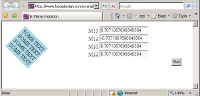
Someone who actually understands what's going on with the matrices could probably explain what's happening (probably I have the co-ordinate system the wrong way up?) but I fell back on trial and error and eventually decided that swapping b and c worked. See my final matrix calculator here - input an angle in degrees, click the button and see the CSS code for achieving it in IE, Gecko and WebKit.
Some things I noticed but didn't have time to investigate fully:
- IE seems to rotate around the center, Firefox and Chrome seem to rotate from top left. There's a -moz-transform-origin and equivalent WebKit property to control things in those browsers, not sure what equivalents IE offers.
- Other CSS declarations are applied after the transform in IE, while they seem to be applied before the transform in Firefox and Chrome (ie. if you add 200px padding to the top of an element, Firefox will rotate around a point 200px above the 'start' of the element, IE will apply 200px padding after the transform).
- Using the
rotatesyntax in Gecko and WebKit is a lot simpler, but if you want to rotate stuff in IE too using a similar format in all three might be more simple in the long run? Especially if you want to script it.
| Print article | This entry was posted by robertc on 04/09/09 at 12:38:03 am . Follow any responses to this post through RSS 2.0. |
-
-
 Wade: OK. Nevermind my previous comment. I kept working at it and…
- Wade: Thank you for this post. I’m a PHP noob. I’ve t…
 Alen Saqe: Thank you for the information. I updated using Windows so i…
 Tim: I am having mixed results aswell. I changed some of the fau…
 robertc: Hi Bert. You would have to mess around with co-ordinate sys…
 Bert Casier: This is nice!
Is there a way to specify pixel values for…
Bert Casier: This is nice!
Is there a way to specify pixel values for…
Buy my book!
 Hello! HTML5 and CSS3 available now
Buy my other book!
 Early access to HTML5 in Action available now