
IE10 and the Future of CSS Layout
Last week the first developer preview of IE10 was released. Among several experimental features included were the first Microsoft implementations of CSS3 Flexible Box Layout Module and CSS3 Grid Alignment. These are possibly the most exciting things to be added to CSS since drop shadows...
First up the flexible box layout module, or flexboxes. This has already been implemented in Firefox and WebKit, but that version of flexboxes isn't very intuitive, and the draft has since seen a lot of updates. Interestingly, IE10PR1 implements the same version of the spec as Firefox and WebKit but with one important addition: multi-line flexboxes. For me the multi-line properties are what make flexboxes worthwhile for layout, otherwise nearly everything you might currently want to achieve can be done just as easily (and with better backwards compatibility) with display: table-cell.
This is the sort of thing that multi-line flexboxes are useful for, it's a layout typical of shopping and photo gallery sites:

Here's what my markup looks like, nothing more complex than a list with sixty items in it:
<ul>
    <li>1</li>
    <li>2</li>
    <li>3</li>
    ...
    <li>59</li>
    <li>60</li>
</ul>
And here's the CSS, the key things to look out for are the display: -ms-box and the -ms-box-lines:
body {
    width: 90%;
    margin: 0 5%;
}
ul {
    display: -ms-box;
    -ms-box-lines: multiple;
    list-style: none;
    width: auto;
    padding: 10px;
    border: 4px dashed #000;
}
li {
    display: block;
    -ms-box-flex: 1;
    padding: 1em;
    margin: 0.5em;
    min-width: 3em;
    border: 4px dashed #000;
}
You may be thinking that's not a hard thing to pull off, so let me show you the same page, in an 800 pixel wide browser above, at 640 and 480 pixels:


The number of cells across adjusts to match the width available, but, because these are flexboxes, the width of the elements themselves also adjust so that they always exactly fit the available width. This is unique among our current alternatives:
- If you were using floats or inline blocks then you'd have to set each element to a fixed width, meaning the container would have to be a fixed width so that the elements could fill it exactly. You'd have to use media queries to assign different fixed widths to the container to change the items per row according to screen resolution.
- If you were using a layout table or display: table-cell then, although the elements would expand to fit exactly, the number of items per row would be fixed by the markup.
However, nothing is perfect. My multi-line flexbox example has a total of 60 elements, and I picked this number because it is an exact multiple of 2, 3, 4, 5 and 6 (it's the expansion of them if I've got my maths terms right ) - meaning that the number of elements will fill the grid whether there's 2, 3, 4, 5 or 6 elements per row. If there's a less perfect number, say 24, then the grid will look a little strange on the last row:

I think the box-align property should help with this, but I couldn't make it work in IE10PR1.
So, multi-line flexboxes could be a useful addition to the CSS toolbox when everyone gets round to upgrading to IE10, but, cool as they are, that's not the coolest experimental CSS layout implementation in IE10PR1. There have been a few grid and template based CSS proposals over the years but, apart from an incomplete JavaScript library for CSS Template Layout, none of them have ever been implemented in a major desktop browser. That is until last week, when IE10PR1 implemented Microsoft's own CSS Grid Align proposal from October 2010.
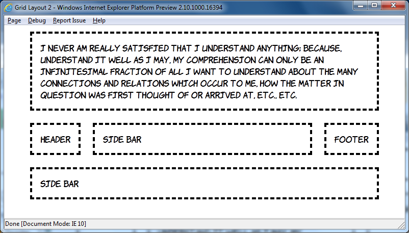
I want you to reflect, now, on all the fun you've had over the last ten years constructing CSS layouts of three equal height columns, with a header and footer, and making them work in IE6. Layouts something like this:

Are you remembering all the fun you had? Good, now look at this markup and contemplate how you'd turn it into a three column layout:
<header>Header</header>
<aside class="b">Side bar</aside>
<article>I never am really satisfied...</article>
<aside class="d">Side bar</aside>
<footer>Footer</footer>
Now look at this CSS and start wishing the future would arrive soon:
body {
    width: 90%;
    margin: 0 5%;
    display: -ms-grid;
    -ms-grid-columns: auto minmax(min-content, 1fr) auto;
    -ms-grid-rows: auto minmax(min-content, 1fr) auto;
}
article, aside, header, footer {
    margin: 1em;
    padding: 1em;
    outline: 4px dashed black;
}
header { -ms-grid-column: 1; -ms-grid-row: 1; -ms-grid-column-span: 3; }
aside.b { -ms-grid-column: 1; -ms-grid-row: 2; }
article { -ms-grid-column: 2; -ms-grid-row: 2; }
aside.d { -ms-grid-column: 3; -ms-grid-row: 2; }
footer { -ms-grid-column: 1; -ms-grid-row: 3; -ms-grid-column-span: 3; }
That's it, seven declarations is all you need for that three column layout with CSS Grid Align. For this first example I'm going to step through the key points line by line:
display: -ms-grid;
This is the bit which declares we will use the grid layout manager on the children of this element, in the same way that the flexbox layout manager was declared above with display: -ms-box.
-ms-grid-columns: auto minmax(min-content, 1fr) auto;
This line defines three columns, the first and last will shrink to fit the content - that's the default behaviour, similar to a table. The middle column will be a minimum of min-content, which is basically the same as auto, and a maximum of 1fr which is a 'fraction of available space' - quite similar to a flex unit and, since there's only one fractional column, basically equivalent to all the available space.
-ms-grid-rows: auto minmax(min-content, 1fr) auto;
We'll have three rows to go along with our three columns, I won't go over the individual values again. Now the fun stuff:
header { -ms-grid-column: 1; -ms-grid-row: 1; -ms-grid-column-span: 3; }
Put the header in the first column of the first row, and make it span three columns. That's it. Really, it's that simple. Let's just do one more:
article { -ms-grid-column: 2; -ms-grid-row: 2; }
Put the article in the second column and the second row. And make me some coffee, white, no sugar. Actually there isn't a CSS property for that yet, maybe CSS4...
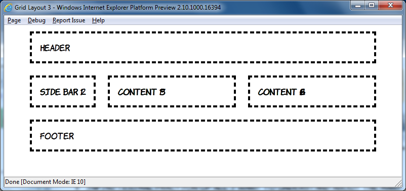
But it gets more cool than that. In the example above the order of the elements in the markup matched up with the order they were placed into the grid, but it doesn't have to be that way:
This amazing transformation was achieved without any changes in markup, just messing around with CSS:
header { -ms-grid-column: 1; -ms-grid-row: 2; }
aside.b { -ms-grid-column: 2; -ms-grid-row: 2; }
article { -ms-grid-column: 1; -ms-grid-row: 1; -ms-grid-column-span: 3; }
aside.d { -ms-grid-column: 1; -ms-grid-row: 3; -ms-grid-column-span: 3; }
footer { -ms-grid-column: 3; -ms-grid-row: 2; }
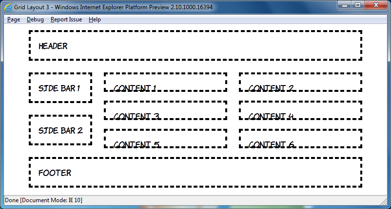
In the current draft there's a grid-cell-stacking property which will let you flow multiple elements into a single cell, but in the IE10PR1 implementation things just stack on top of each other:
This is a shame, because the markup is quite straightforward, I won't post all of it because this is already getting quite long (have a look), but here's the nice bit:
article:nth-child(2n+1) { -ms-grid-column: 1; }
article:nth-child(2n) { -ms-grid-column: 2; }
The article elements are assigned to grid cells alternately, unfortunately it doesn't work yet. However you can nest elements set to display: -ms-grid inside each other:
Have a look at the source code for that one, it gets pretty hairy, so rather than try and do that sort of thing it's probably best to use some wrapper elements like this:

Again, view the source code yourself to see how it's put together, but I think these things will be worth re-visiting in a later preview release.
I'm going to finish off with some adaptive layout. Grid Align is a great fit for this because of the complete independence of layout from source order. Here's what I put together based off the previous example at 800 pixel width:

Now here's the same page at 640 and 480 pixel widths:
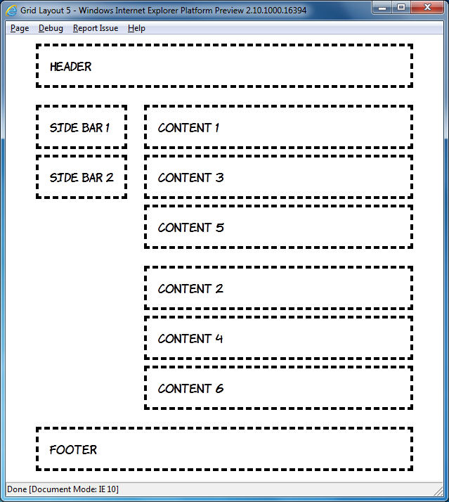
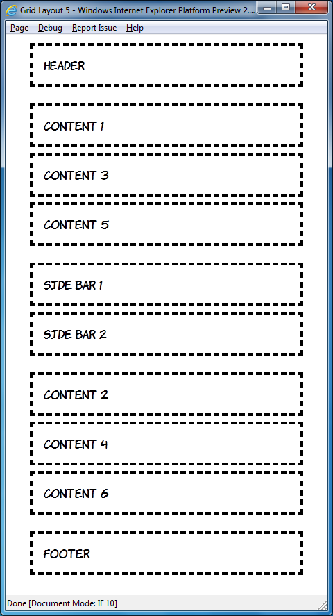
The markup is, of course, the same in each case:
<header>Header</header>
<div id="sidebar">
    <aside>Side bar 1</aside>
    <aside>Side bar 2</aside>
</div>
<div id="content1">
    <article>Content 1</article>
    <article>Content 3</article>
    <article>Content 5</article>
</div>
<div id="content2">
    <article>Content 2</article>
    <article>Content 4</article>
    <article>Content 6</article>
</div>
<footer>Footer</footer>
By default I've assumed a single column layout:
body {
    width: 90%;
    height: 90%;
    margin: 0 5%;
    display: -ms-grid;
    -ms-grid-rows: auto;
    -ms-grid-columns: 1fr;
}
article, aside, header, footer {
     margin: 1em;
     padding: 1em;
     outline: 4px dashed black;
}
header { -ms-grid-row: 1; }
#sidebar { -ms-grid-row: 3; }
#content1 { -ms-grid-row: 2; }
#content2 { -ms-grid-row: 4; }
footer {  -ms-grid-row: 5; }
Moving on to windows of a minimum width of 600 pixels, move up to two columns:
@media screen and (min-width: 600px) {
    body {
        -ms-grid-columns: auto 1fr;
        -ms-grid-rows: auto 1fr 1fr auto;
    }
    header { -ms-grid-column: 1; -ms-grid-row: 1; -ms-grid-column-span: 2; }
    #sidebar { -ms-grid-column: 1; -ms-grid-row: 2; -ms-grid-rowspan: 2; }
    #content1 { -ms-grid-column: 2; -ms-grid-row: 2; }
    #content2 { -ms-grid-column: 2; -ms-grid-row: 3; }
    footer { -ms-grid-column: 1; -ms-grid-row: 4; -ms-grid-column-span: 2; }
}
This is nothing you haven't seen already, but I'll just point out again how cool it is that you can place the elements wherever you want them. Finally, for windows of greater than 760 pixels width, switch back to the three column layout:
@media screen and (min-width: 760px) {
    body {
        -ms-grid-columns: auto 1fr 1fr;
        -ms-grid-rows: auto 1fr auto;
    }
    header { -ms-grid-column: 1; -ms-grid-row: 1; -ms-grid-column-span: 3; }
    #sidebar { -ms-grid-column: 1; -ms-grid-row: 2; }
    #content1 { -ms-grid-column: 2; -ms-grid-row: 2; }
    #content2 { -ms-grid-column: 3; -ms-grid-row: 2; }
    footer { -ms-grid-column: 1; -ms-grid-row: 3; -ms-grid-column-span: 3; }
}
If you've downloaded the IE10 developer preview have a play round with it yourself, and try not to think about how long you'll have to wait until all this stuff is available in production browsers 
| Print article | This entry was posted by robertc on 20/04/11 at 01:16:00 am . Follow any responses to this post through RSS 2.0. |
-
-
 Wade: OK. Nevermind my previous comment. I kept working at it and…
- Wade: Thank you for this post. I’m a PHP noob. I’ve t…
 Alen Saqe: Thank you for the information. I updated using Windows so i…
 Tim: I am having mixed results aswell. I changed some of the fau…
 robertc: Hi Bert. You would have to mess around with co-ordinate sys…
 Bert Casier: This is nice!
Is there a way to specify pixel values for…
Bert Casier: This is nice!
Is there a way to specify pixel values for…
Buy my book!
 Hello! HTML5 and CSS3 available now
Buy my other book!
 Early access to HTML5 in Action available now