
Attempting Better Drop Shadows in IE8 - Filters Revisited
I was reading about cssSandpaper today and my curiosity was sparked by this line:
Note that in IE, the blur-radius is not currently not supported, due to a lack of support in IE’s DropShadow filter.
This is true, DropShadow doesn't support blur radius. The alternative Shadow filter does have a blur radius like property, Strength, which "Sets or retrieves the distance, in pixels, that a filter effect extends."
So there are two basic options, both with their own advantages and disadvantages:
- DropShadow - you can use alpha transparent colours and specify separate offsets, but the colour remains solid and sharp edged
- Shadow - you can specify a blur radius type property but you cannot set separate x and y offsets, the colour will fade to transparent but you have no control over it, and the results also remain solid and sharp edged
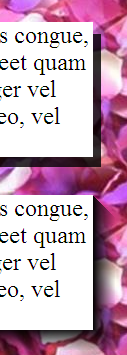
Basically, drop shadows in IE look like they were designed by developers rather than graphic designers, see for yourself in the example to the right - top is DropShadow, bottom is Shadow, hard edges in both cases.
Many, like myself, have taken the position that this can't be helped, we should be grateful to be able to do drop shadows at all in CSS for IE, and just picked one of the two options and got on with things. However, at least in IE8, there may be some further options which are worth investigating. The following text is on every MSDN filter page:
You can assign multiple filters or transitions to an object by declaring each in the filter property of the object.
And guess what? There is a Blur filter and, if that turns out to be no good, there's also a MotionBlur and a Glow which we may be able to do something with. So my strategy in this post is to apply some of these in combination with DropShadow and Shadow to see if we can get slightly more natural looking CSS drop shadows in Internet Explorer. First, lets remind ourselves what an IE drop shadow looks like:

And here's the code:
<div style="position: relative; height: 30px; filter:
    progid:DXImageTransform.Microsoft.DropShadow(OffX=6, OffY=4, Color='gray')
    ">Straight drop shadow example</div>
Let's try adding a blur to that and see what happens:

As you can see, the blur effect applies to the shadow but it also applies to the contents.
<div style="position: relative; height: 30px; filter:
    progid:DXImageTransform.Microsoft.DropShadow(OffX=6, OffY=4, Color='gray')
    progid:DXImageTransform.Microsoft.Blur(pixelradius=2)">
        0 Example text, should not have shadow or be blurred.</div>
I wondered if I could wrap the contents in another element and protect it somehow from the filter.

A shadow on an element with a transparent background will produce a text shadow, while a background colour will cause the shadow to apply to the box. So I thought it was worth a try, and I thought I'd trigger hasLayout to be on the safe side:
<div style="height: 30px; filter:
    progid:DXImageTransform.Microsoft.DropShadow(OffX=6, OffY=4, Color='gray')
    progid:DXImageTransform.Microsoft.Blur(pixelradius=2)">
        <span style="height: 30px; zoom:1; background-color: #fff;">
            1 Example text, should not have shadow or be blurred.</span></div>
Not much joy there, but I did have a bit better luck with the next attempt:

By making the child element absolutely positioned the filters were now ignored on the containing element, of course the containing element is now empty so needs an explicit height to keep it open:
<div style="position: relative; height: 30px; filter:
    progid:DXImageTransform.Microsoft.DropShadow(OffX=6, OffY=4, Color='gray')
    progid:DXImageTransform.Microsoft.Blur(pixelradius=2)">
        <span style="position: absolute; height: 30px; zoom:1; background-color: #fff;">
            2 Example text, should not have shadow or be blurred.</span></div>
The problem is that the span now pokes out of the containing div, so I tried fitting it more exactly:

Quite a lot of additional markup is now getting tacked on, for really not much aesthetic benefit. Having the absolutely positioned child match the dimensions of the containing div does mean that you can cover up the blurry top and left edges, but the tradeoff is the elements need to have known dimensions.:
<div style="position: relative; height: 30px; filter:
    progid:DXImageTransform.Microsoft.DropShadow(OffX=6, OffY=4, Color='gray')
    progid:DXImageTransform.Microsoft.Blur(pixelradius=2)">
        <span style="position: absolute; top: 2px; left: 2px; height: 30px; width: 100%; display: inline-block; background-color: #fff;">
            3 Example text, should not have shadow or be blurred.</span></div>
Since the shadow still looks crappy I thought I'd try a few different combinations. Motion blur:

And the code:
<div style="position: relative; height: 30px; filter:
    progid:DXImageTransform.Microsoft.Dropshadow(OffX=6, OffY=4, Color='gray')
    progid:DXImageTransform.Microsoft.MotionBlur(direction=135,strength=8,add=true)">
        <span style="position: absolute; height: 30px; width: 100%; display: inline-block; background-color: #fff;">
            4 Example text, should not have shadow or be blurred.</span></div>
Glow:

More code:
<div style="position: relative; height: 30px; filter:
    progid:DXImageTransform.Microsoft.Dropshadow(OffX=6, OffY=4, Color='gray')
    progid:DXImageTransform.Microsoft.Glow(strength=2,Color='gray')">
        <span style="position: absolute; top: 1px; left: 1px; height: 30px; width: 100%; display: inline-block; background-color: #fff;">
            5 Example text, should not have shadow or be blurred.</span></div>
What about just applying multiple drop shadows?

The above image combines four:
<div style="position: relative; height: 30px; filter:
    progid:DXImageTransform.Microsoft.Dropshadow(OffX=4, OffY=4, Color=#cc999999)
    progid:DXImageTransform.Microsoft.Dropshadow(OffX=4, OffY=4, Color=#99999999)
    progid:DXImageTransform.Microsoft.Dropshadow(OffX=4, OffY=4, Color=#66999999)
    progid:DXImageTransform.Microsoft.Dropshadow(OffX=4, OffY=4, Color=#33999999)">
        <span style="position: absolute; height: 30px; width: 100%; display: inline-block; background-color: #fff;">
            6 Example text, should not have shadow or be blurred.</span></div>
Getting a bit far out now, multiple drop shadows and blur:

<div style="position: relative; height: 30px; filter:
    progid:DXImageTransform.Microsoft.Dropshadow(OffX=4, OffY=4, Color=#cc999999)
    progid:DXImageTransform.Microsoft.Dropshadow(OffX=4, OffY=4, Color=#99999999)
    progid:DXImageTransform.Microsoft.Dropshadow(OffX=4, OffY=4, Color=#66999999)
    progid:DXImageTransform.Microsoft.Dropshadow(OffX=4, OffY=4, Color=#33999999)
    progid:DXImageTransform.Microsoft.Blur(pixelradius=2)">
        <span style="position: absolute; height: 30px; width: 100%; display: inline-block; background-color: #fff;">
            7 Example text, should not have shadow or be blurred.</span></div>
Enough of that, I thought I'd try a few examples with shadow instead of drop shadow:

The basic shadow fades out but, as I mentioned, is sharp edged.
<div style="position: relative; height: 30px; filter:
    progid:DXImageTransform.Microsoft.Shadow(Direction=135, Strength=5, Color='gray')">
        Straight shadow example</div>
Now a shadow with a blur:

<div style="position: relative; height: 30px; filter:
    progid:DXImageTransform.Microsoft.Shadow(Direction=135, Strength=5, Color='gray')
    progid:DXImageTransform.Microsoft.Blur(pixelradius=2)">
        <span style="position: absolute; top: 2px; left: 2px; height: 30px; width: 100%; display: inline-block; background-color: #fff;">
            3 Example text, should not have shadow or be blurred.</span></div>
A shadow with motion blur:

And with glow:

Yes, they all still look a bit pants.
So it seems like Shadow and Blur in combination may be the best of a bad bunch, and they don't really give you too many advantages: you have to know the dimensions of the element in advance for it to be useful in CSS; you might be able to work a jQuery plugin out of it, but if you're going to rely on scripting you might as well make use of once the image based solutions which result in nicer looking shadows; and finally, all of the above only works in IE8 - IE7 applies all the filters to the contained element whether it's positioned or not. So, wasted effort? Possibly, at least now I know for sure, here's hoping IE9 adds support for box-shadow ")
| Print article | This entry was posted by robertc on 30/06/10 at 11:21:02 pm . Follow any responses to this post through RSS 2.0. |
-
-
 Wade: OK. Nevermind my previous comment. I kept working at it and…
- Wade: Thank you for this post. I’m a PHP noob. I’ve t…
 Alen Saqe: Thank you for the information. I updated using Windows so i…
 Tim: I am having mixed results aswell. I changed some of the fau…
 robertc: Hi Bert. You would have to mess around with co-ordinate sys…
 Bert Casier: This is nice!
Is there a way to specify pixel values for…
Bert Casier: This is nice!
Is there a way to specify pixel values for…
Buy my book!
 Hello! HTML5 and CSS3 available now
Buy my other book!
 Early access to HTML5 in Action available now